
Why We’re 100% On Board with Embracing This Timeless Hue

Pantone’s newly released color for 2020 is officially “Classic Blue.” True to its name, it’s a shade that is recognizable and timeless, giving off a feeling of comfort and steadfastness. And if you’ve followed our work, you know that we’re no strangers to incorporating blue into our designs. After all, it manages to be both versatile and steady all at once, and that’s something that makes for spaces that last.
Thinking about how to use Classic Blue in your own home? Read on – we’re dishing on all the reasons to love this color. Pretty soon, it’ll be a go-to in your arsenal for 2020 and beyond.
Reason #1: It manages to be both feminine and masculine at once
Some colors feel inherently masculine or feminine, but when it comes to Classic Blue (and blue in general), it somehow fulfills both roles. Depending on the materials and patterns used, you can easily transition between each realm and combine the two for a layered and visually interesting look. For those of you who have ever struggled to combine two different styles in a home, this is a welcome relief. Though you may need to work out furniture silhouettes over overall aesthetics, one thing’s for sure – with your design rooted in blue, it’ll feel like the perfect fit all around.


Reason #2: It’s a pop of color that isn’t too trendy
Though we love a pop of color, sometimes if you opt for something that’s too trendy or in-the-moment, after a year or two it can feel outdated and tired. If you love adding an infusion of color to your space, though, using Classic Blue is the ideal way to get the look you love (but without the short lifespan).

RELATED: Wilds Overlook Basement Design Details!

Reason #3: With the right palette, it can feel like a bold neutral
There are certain colors that, while bold, can still feel like neutrals since they pair so well with such a wide variety of other shades. Blue is definitely one of them. Whether you’re adding a touch of interest to a largely neutral space or combining it with shades of red, green, or yellow, the color blue is always in style. Plus, if you vary the saturation a bit, there’s no limit to the possibilities that abound.

RELATED: Benjamin Moore Hale Navy: Paint Color Review

Reason #4: It’s calming & gives us all the nature vibes
Blue, by nature, is a calming color – it helps us relax, which means it’s a must have in either a bedroom or master bathroom. Evoking fond memories of water and the sky, it helps us feel connected to nature (no matter the season). In a world that’s filled with stress and never ending to-do lists, a dose of Classic Blue can be just the antidote we all need to stop and live in the moment.

Love this wallpaper? It’s available HERE.
Many of my posts contain affiliate links. If you click on an affiliate link and purchase something, I may receive a small commission at no additional cost to you. The affiliate money I earn helps pay the fees to keep this site up and running. You can read our disclosure statement here. Thank you so much for your support.
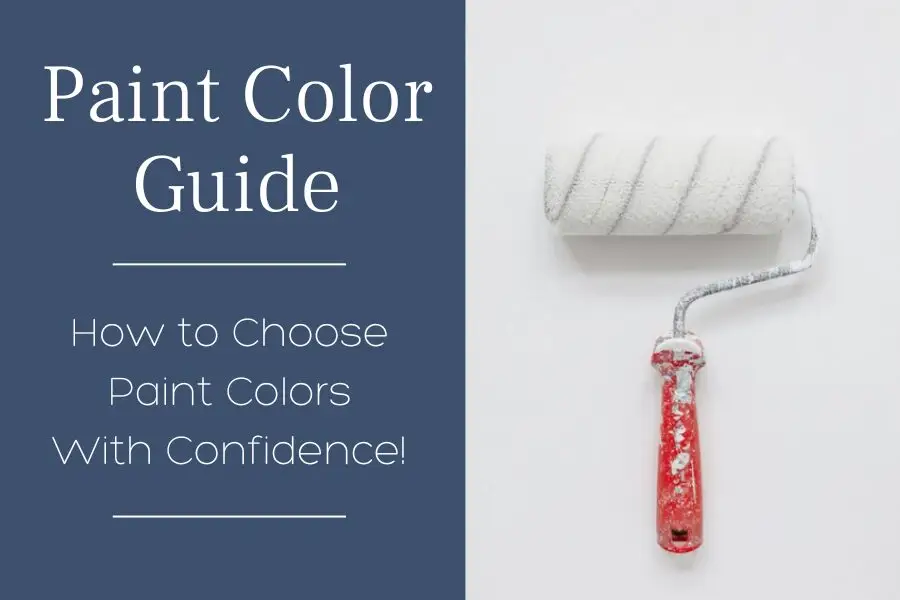
WHATS THE BEST WAY TO SAMPLE PAINT COLORS?
Look no further than SAMPLIZE! Using a peel and stick paint sample is cleaner, easier to use, more affordable, AND more environmentally friendly.

Here’s why I recommend SAMPLIZE to my clients:
1. Cost-Effective: They’re more budget-friendly than traditional methods, which often require purchasing sample pots, rollers, and tag boards.
2. Easy to Use: Keep your Samplize samples on their white paper backing and you can effortlessly move them around the room to see how they look in different lighting conditions.
3. Speedy Delivery: Samplize samples arrive at your doorstep in just one day, depending on your location.
Visit the SAMPLIZE website HERE to explore their range of options.

Get your peel & stick (real) paint sample of Classic Blue – HERE!
Be sure to check out our paint color reviews for more inspiration.
Classic Blue is about as versatile as it gets, and we love it on everything from a freshly painted front door to an upholstered sofa or throw pillow. We couldn’t be more excited for its release, and we’ve got a feeling you’ll fall in love with it over and over again. When it comes to design, there’s nothing better.


17 Responses
Classic and fresh, too. Doesn’t get any better than that. Especially love it against the exposed brick. Your work is gorgeous!
Beautiful examples of how classic blue can be used in different ways in many types of rooms! Thanks for the inspiration!
Beautiful work! And a lot of gorgeous inspiration for using this classic color! Those blue velvet toss pillows with the white embroidery in that last bedroom are to-die-for!
I had never thought about how this color can bridge the gap between masculine and feminine in design. Great point!
Love all the blues and your projects are gorgeous using this color of the year!
Hi Carla.. What a beautiful collection of work, using this calming hue that’s such a classic and a favorite of so many people. Thanks for the inspiration!
Beautiful! Love the wallpaper in the bathroom. Who makes it? Thank you!
Hi Diana, Thank you for your comment, we love that wallpaper too! If you are interested in purchasing, it is available through Carla Bast Design, contact us for details.
I’m interested in purchasing the wallpaper for the bathroom!
HI Cindy, I’ll send you an email!
I am interested in purchasding the bathroom wallpaper
Hi Deirdre, Let us know the quantity you need and we are happy to send you a quote!
You can email: hello@carlabast.com and we will respond promptly.
The powder room is beautiful!!! Where are the wallpaper and vanity from? Thank you!
Kelly Ryan-Jimenez, Thank you so much! The wallcovering is available through Carla Bast Design, let us know if you are interested and the quantity needed. The vanity was designed by Carla Bast Design and was custom made.
Hello, I am interested in info on the pretty wallpaper shown in the bathroom with navy vanity.
I love the bathroom wallpaper and wanted to see if I could get pricing to purchase? Thank you!
Hi Danielle- Please reach out to us at hello@carlabast.com for more information on this beautiful wallcovering.