
Stylish Solutions That Actually Work
So, you chose something you loved in the moment, a backsplash that felt bold, a paint color that looked amazing on Pinterest, or maybe a granite countertop that seemed like the safe bet. Or maybe you inherited a home with finishes you never would’ve chosen yourself. And now… something’s off. Design mistakes happen, and yes, some of them are stuck in place. But that doesn’t mean you’re stuck with them forever. This blog post is packed with practical, designer-approved ways to fix design mistakes without replacing everything.
Not sure what to tackle first in your home? This is how I’d walk through it with a client.

A simple, step-by-step way to see your home through a designer’s lens before making changes.
Whether you’re dealing with clashing finishes in the kitchen, too many competing patterns in the bathroom, a living room drowning in gray-on-gray, or a dining room that just doesn’t flow, I’ll show you how to work with what you have and create a space you love. No demo required to take the focus away from these most common interior design mistakes. We’ll cover everything from selecting the right paint color and color palette, to how the right design plan, focal point, or even table lamps can shift how a room feels. Plus, I’ll share how you can rethink your layout, use light effectively, and style your space with good design practices that will make all the difference.
These design principles apply to every room in your home, from the entryway and powder bath to your bedroom, home office, living room, and dining room. You’ll learn simple tips to correct the most common mistakes made with flooring, furniture, wall color, accessories, and lighting, and how to choose the right rug, style a gallery wall, or improve traffic flow in your space using thoughtful updates.
Pin this for easy reference:

Let’s dive in.
Many of my posts contain affiliate links including this one on simple neutral fall decor. If you click on an affiliate link and purchase something, I may receive a small commission at no additional cost to you. The affiliate money I earn helps pay the fees to keep this site up and running. You can read our disclosure statement here. Thank you so much for your support.
Identify the Real Problem (It’s Not Always What You Think)
The first step? Pinpoint exactly what isn’t working. It might seem obvious, but the real issue often isn’t the entire room, it’s one or two elements throwing everything off.
Here’s where most homeowners go wrong: they assume they need a total overhaul when, in reality, just one finish, color, or layout decision is fighting with the rest of the room. Identifying the root cause lets you work smarter, not harder.

How to assess your space like a designer:
- Do a slow walkthrough of each room during morning, midday, and evening to see how natural light changes the colors and materials.
- Take a snapshot of the space on your phone. Sometimes, seeing the room in a photo helps you spot mismatches or odd proportions more clearly.
- Look for the visual interrupter – the element your eye keeps landing on, but not in a good way.
- Consider scale and proportion – an oversized sectional or too-small rug can make the entire room feel “off,” even if everything else is beautiful.

Common culprits in design mistakes:
- Busy backsplashes and mosaic tile with intense patterns or colors in kitchens or bathrooms
- Clashing countertops and backsplashes that compete instead of complement
- Too many bold materials, like patterned tile, granite, and bold flooring all at once
- A paint color that doesn’t work with your finishes or overall color scheme
- Cool-toned color palettes clashing with warm-toned floors or wood trim
- Overwhelming use of gray making rooms feel cold or sterile
- A lack of a clear focal point in shared spaces
- Misjudged room size or scale of furniture, especially in smaller areas like bathrooms, home offices, or entryways
- Ignoring the importance of a design plan before purchasing major pieces such as flooring, tile and even furniture.
- Using artwork/decor that’s too small for the scale of the space.
Over the years, some of the most common design mistakes I see come down to clashing finishes, poor lighting, and the wrong paint color for the space.
Before & After Scenario:

Use Neutrals to Calm the Chaos
If your living room, bathroom, bedroom, or dining area feels overwhelmed by visual noise or clashing finishes, neutrals can be your secret weapon. But this doesn’t mean your space has to feel bland, done well, a neutral palette actually creates the perfect backdrop for your furniture, art, and personal style.
Designer strategies for a cohesive neutral palette:
- Layer in neutral textures – Think waffle weave towels in the bathroom, textured throw pillows in the living room, a chunky throw blanket, and baskets for storage.
- Choose bridging neutrals – A warm greige wall color can connect cool gray tile to warm wood tones, softening the transition.
- Swap bright white for softer shades – Stark white can create jarring contrast with colorful finishes. Creams, warm whites, and light taupes blend more gracefully with most existing finishes.
- Ground the space with a neutral rug – This works especially well where you can’t change the flooring but want to work with it and create a balance in the entire space.
- Mix finishes mindfully – Combining matte, woven, and smooth finishes in the same neutral family creates a collected, designer curated look.


Before & After Scenario:
This home owner installed a busy herringbone tile in a shade of gray. She felt that she had made an expensive mistake in going with the gray color and busy pattern. I love how the countertops look with the backsplash tile and center island color. I would, however, change out the window valance to a sold color.


Before you paint, renovate, or replace anything, this is where I’d start.
It helps you spot the things most homeowners miss before spending money or making permanent changes.
Use Strategic Paint Colors to Balance the Look
Paint is one of the most budget-friendly tools in your arsenal. It’s often the quickest way to fix design mistakes without replacing anything major.
Smart paint fixes for common challenges:
- Tone down dated tile – Warm beige or taupe walls can soften the starkness of high-contrast tile.
- Unify clashing tones – In a kitchen where the floor and cabinets don’t match, a mid-tone wall color can create a bridge between the two.
- Add drama where needed – A deep navy or bold accent color on the walls can make older floors feel intentional and sophisticated.
- Brighten dim rooms – Soft, warm whites or light greiges reflect more light without feeling sterile.
- Use a matte paint finish – Minimize the look of cracks and imperfections on walls or ceilings with less shine.


RELATED: Best Neutral Paint Colors to Update Your Home in 2025
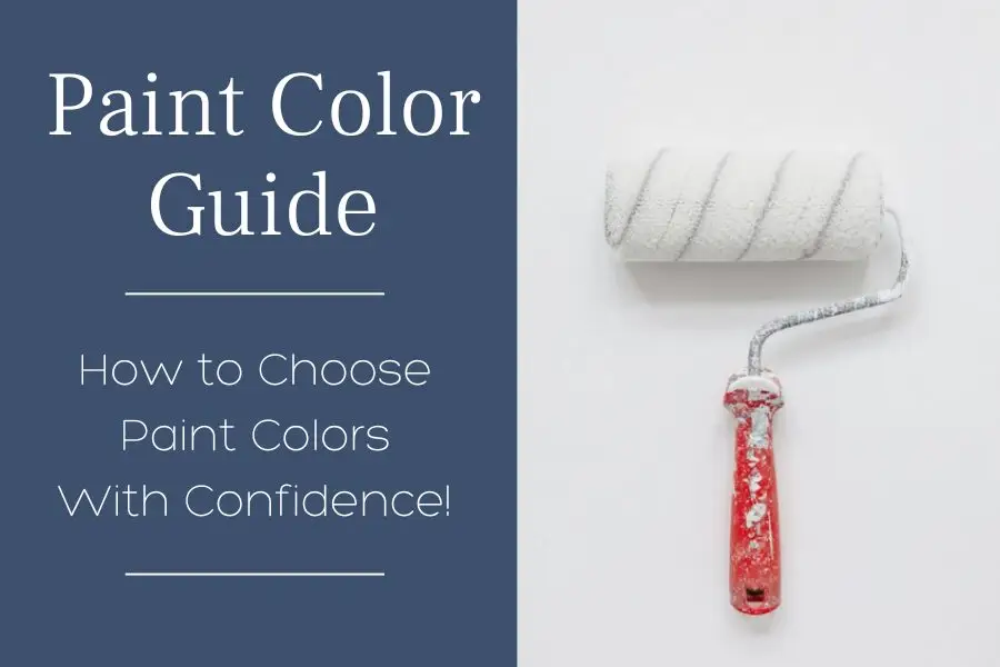
Struggling to choose paint colors?
Nail your color choice the first time! Here’s my How-To Guide so you can choose paint colors with confidence!

Layer with Intention to Redirect the Eye
When you can’t remove the design flaw, disguise it with thoughtful layering. This works whether you’re hiding an awkward wall color, a busy backsplash, or dated flooring.
Ways to layer with purpose:
- Large-scale art or an oversized mirror draws the eye upward, away from the floor.
- A patterned area rug can mask unchangeable tile or wood tones while introducing your desired color palette.
- Drapery in a rich fabric can frame windows and minimize attention on a wall you don’t love.
- Textiles like throws, pillows, and bed linens can subtly introduce colors that help balance the “off” tones in permanent finishes.
- On a large wall, avoid undersized art or leaving them completely bare, both can make a space feel unfinished. Instead, fill the area with an oversized piece, a gallery wall arrangement, or wall molding to create interest and proportion.
Repeat the “Mistake” – On Purpose
Sometimes, the most effective way to fix a design mistake is to lean into it. Repeating an element gives it legitimacy, transforming it from a sore thumb into a deliberate choice.

RELATED: Sherwin Williams Iron Ore, 7069: Paint Color Review
Examples:
- If your trim color is an odd shade of beige, incorporate it in pillow fabrics, lamp bases, or woven baskets.
- If your stone fireplace has an unusual hue, repeat that color in vases, art frames, or cabinet hardware.
- If you have a bold tile pattern you can’t change, echo its colors in smaller decor pieces or even the walls.
Make Lighting & Contrast Work in Your Favor
Lighting can dramatically shift the feel of a space. Sometimes the “mistake” you’re seeing is simply a lighting or layout problem.
Lighting strategies:
- In the living room, flank the sofa with table lamps for balanced, warm light.
- In the bedroom, install wall sconces to free up nightstand space and create a cozy atmosphere.
- In the home office, use layered lighting – overhead, desk, and accent to eliminate harsh shadows.
- In the dining room, a statement chandelier or pendant adds a central focal point.
- Check the Kelvins on your light bulbs—cooler bulbs (4000K and above) can make warm paint colors look cold or even blue, while warmer bulbs (2700K–3000K) tend to create a more inviting glow.
A lesson learned the hard way: Early in my career, I selected a gorgeous paint color for a foyer and hallway that looked perfect in natural daylight. But at night, under the existing lighting, it took on an icy blue cast, completely different from what I intended. The fix? We swapped the bulbs for warmer light, and just like that, the paint color looked exactly as it did during the day. Sometimes, the right bulb temperature is the simplest solution of all.
Even subtle changes in lighting temperature, or fixture placement can make existing finishes feel more at home.

The Most Common Mistake in Large Rooms
One of the most common mistakes I see in a large room is choosing built-ins or fireplaces that are too small in scale for the space. A standard-size fireplace surround or a set of narrow built-ins might work beautifully in a smaller room, but in two story living room or open-concept space, they can look lost on an expansive wall. This throws off the balance of the entire design and makes the room feel unfinished.
How to fix it:
- Visually extend the fireplace by adding floor-to-ceiling millwork.
- Widen the footprint of built-ins with side cabinetry, open shelving, or decorative paneling.
- Use paint strategically—a contrasting wall color can frame the feature and give it more presence.
- Add vertical emphasis with oversized art, mirrors, or decorative panels above to draw the eye upward.
Before & After Scenario:

The Most Common Mistake in Small Rooms
In smaller rooms, the most common mistake I see is using finishes or colors that make the space feel even smaller and more closed-in. Heavy, dark wall colors, overly busy patterns, or bulky trim can crowd the eye and make a room feel boxy—especially if the finishes absorb light instead of reflecting it.
How to fix it:
- Lighten the wall color with a soft white, warm neutral, or pastel that bounces light around the room.
- Keep flooring consistent with adjacent spaces to create visual flow and reduce the sense of boundaries.
- Use vertical elements – like tall drapery panels from floor to ceiling, or vertical panels or molding, to make ceilings feel higher.
- Simplify the finish palette so there’s less visual competition; limit yourself to two or three dominant tones.
You Don’t Have to Start Over
Decorating mistakes are very common. The secret to good design is knowing how to pivot. Whether you’re working with a small room, oversized furniture, mismatched finishes, or a not-quite-right paint color, the fix doesn’t always require replacing anything.
By implementing the strategies in this blog post – like adjusting your color palette, adding a new focal point, enhancing lighting, and repeating finishes, you can create a home that feels fresh, polished, and pulled together.
No matter the room – bathroom, bedroom, kitchen, dining room, home office, or living room, you can improve the look and feel using smart, strategic updates.
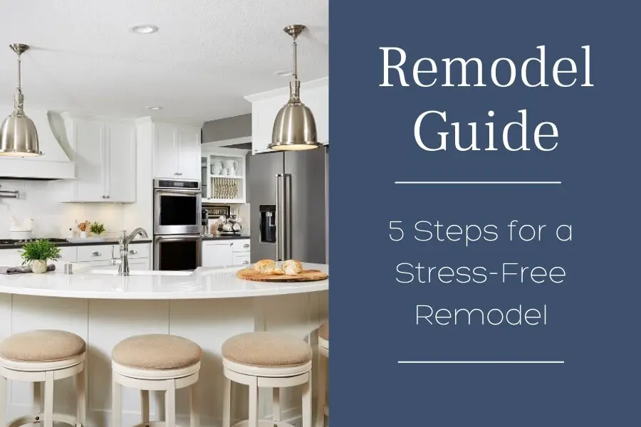
If you want a clear starting point before making changes, start here:

Designed to help you see your home clearly before committing to changes.
With a little creativity and the right approach, you can feel confident that you’re doing the right thing, even if you didn’t get it right the first time.