Best Paint Colors to go with Honey Oak Trim or Cabinets
March 13, 2026

Paint Color Ideas & Tips: Choosing Wall Paint Colors for Honey Oak Cabinets and Trim
Many homes built in the 1980s, 90s, and early 2000s feature honey oak trim or cabinets. While honey oak was once a popular finish, homeowners today often want to update the look without replacing all of the woodwork.
The good news is that the right paint color can dramatically modernize a home with honey oak trim or cabinets. Choosing shades that balance the warm undertones of the wood helps create a more updated and cohesive look.
While oak, in general, can feel outdated, honey oak (also called “golden oak”), in particular tends to feel rooted in the 80’s, 90s and early 2000s. So, how do you deal with it? Whether you’re working within a budget or just aren’t ready to overhaul cabinets or an entire house of trim right now, there’s no need to worry—your honey oak can definitely be enhanced and you can work with what you have!
Updating your paint color is one of the first things, and easiest to tackle. It’s also easy on the budget! In this blog post I’m sharing my top tips for choosing paint colors with honey oak cabinets or trim and several actual paint colors for you to sample.
Designer Resource
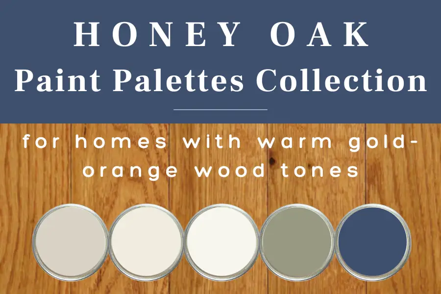
Designer Paint Palettes That Work With Honey Oak Cabinets & Trim
Choosing paint colors that work with honey oak cabinets, trim, and flooring can be tricky. These designer-curated palettes show exactly which wall colors, whites, and accents work beautifully with warm wood tones.
- 15 designer-curated palettes created for honey oak
- Colors that balance honey oak’s warm undertones
- Coordinated wall colors, whites, and accents
- A clear starting point — without second-guessing
Honey Oak vs. Golden Oak
When talking about homes of the late 80s, 90s and early 2000s, You may have heard references to both “honey oak” and “golden oak.” These terms describe the same type of wood and finish that were immensely popular during that time. The names reflect the rich, warm hues of the wood—tones that can range from a deep amber to a vibrant gold, depending on the light. This wood was a staple in homes for everything from cabinetry and trim to flooring and furniture.
As honey oak, or golden oak wood ages, it naturally deepens to a richer amber shade due to the stains and polyurethane treatments applied. By selecting paint colors that complement the tones of honey oak, you can enhance the natural beauty of the wood while giving your space a fresh and modern update.

Will Honey Oak Come Back in Style?
Honey oak enjoyed its heyday in the 80s and 90s, but unfortunately, it’s unlikely to make a comeback anytime soon. Like many trends from that era, it had its time in the spotlight and has since fallen out of favor with interior designers and homeowners alike opting instead for enameled (painted) cabinetry and cooler wood tones.
What paint colors go with honey oak wood trim and cabinets?
Cool grays can feel too harsh and ashy next to the orange golden tones of honey oak. Likewise, colors with pink or purple undertones look out of place as they compete with oak’s warmth instead of complementing it. To keep your room feeling harmonious, choose colors that enhance the warm, welcoming vibe of oak.
Pin this for easy reference:

Modern Paint Colors That Work with Honey Oak Trim or Cabinets
Modernizing a home with honey oak trim or cabinets often comes down to choosing paint colors with balanced undertones. Soft warm whites, greige tones, muted greens, and subtle light blue-grays can all help reduce the orange appearance of honey oak while still complementing the natural warmth of the wood.
First, there are three things you should keep in mind when choosing a paint color to work with your honey oak:
- The color Undertone
- LRV (Light Reflective Value)
- How the color will look in Natural Light and Artificial Light.
What is an Undertone Color?
Paint Undertones: A helpful guide to what they are and why you should care.
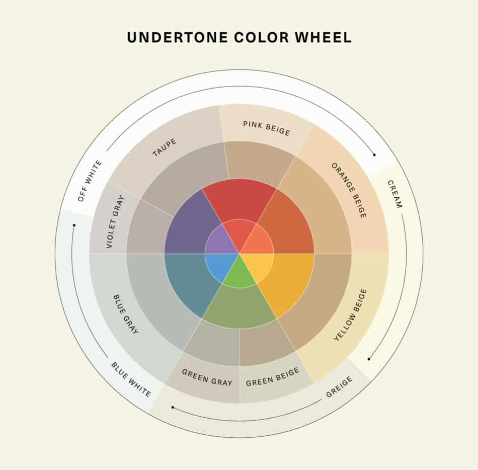
So, you’ve narrowed down your paint chips to two or three perfect colors standing there in the paint store. Then, once you get the paint on the walls, you realize it looks entirely different than you anticipated. The paint undertones are to blame! Undertones are the subtle hues that can be found within a paint color. They have a big impact on how that color will look once it’s applied to your walls. To help you out, here’s an undertone color wheel to identifying paint undertones.
Understanding Undertones on the Color Wheel
When choosing paint colors to pair with honey oak trim or cabinets, it helps to think about undertones on the color wheel. Every paint color contains subtle underlying tones that influence how it will interact with the warm hues of oak.
Warm Undertones
Warm undertones include colors influenced by red, orange, and yellow. Because honey oak already has strong warm tones, overly warm paint colors can sometimes make the wood appear more orange. For this reason, it’s best to avoid colors that lean too heavily toward deep red, orange, or golden yellow. Instead, look for warmer shades that feel soft and balanced rather than saturated or intense.
Cool Undertones
Cool undertones come from blue, green, and violet on the color wheel. These colors can create contrast with honey oak, but if the undertones are too strong, they may make the warmth of the wood stand out even more. Deep blues, purples, and cool grays can sometimes exaggerate the orange tones in oak. When using cooler hues, choose muted or earthy versions rather than highly saturated colors.
Neutral Undertones
Neutral undertones sit closer to the center of the color wheel and tend to feel more balanced and versatile. Soft greige tones, warm whites, and muted earth tones often work beautifully with honey oak because they don’t compete with the warmth of the wood. These shades help create a cohesive look while still giving the space a fresh, updated feel.
In general, when working with honey oak trim or cabinets, the most flattering paint colors are those with subtle undertones rather than strong ones. Shades that are too deep in red, orange, purple, blue, or gray can overpower the wood, while softer, more balanced tones tend to complement it naturally.
What is LRV?
“LRV, or Light Reflectance Value, is a measurement commonly used by design professionals – such as architects and interior designers – that expresses the percentage of light reflected from a surface. LRVs range from 0-100, with 100 being pure white and 0 being absolute black.” – Benjamin Moore
Because LRV affects how a color looks in a space, it is VERY important to consider when choosing a color, even a white color. If you want a color to appear lighter, choose a color with a higher LRV. If you want a color to appear darker, choose a color with a lower LRV.

How does light affect paint color?
A very important and often overlooked factor that can affect how a paint color looks in a room is the light. Natural light from windows can make a room feel bright and airy, while artificial light from lamps and fixtures can give a room a cozy, intimate feeling.
If you’re painting a room with little natural light, use brighter colors with a high LRV. This helps to reflect the light and will make the space feel more open. For rooms with lots of artificial light, darker colors can help absorb the light and create a warm and inviting space.
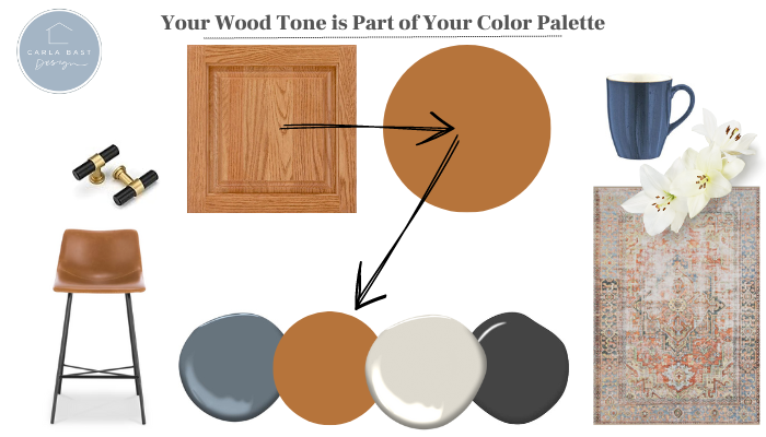
Tip #1: See your honey oak as a color.
Understanding wood tones as part of your color palette is key when working with honey oak trim and cabinets. Rather than seeing them as a separate element, integrating these warm, golden hues into your overall color scheme will create a cohesive look. These finishes bring out its warm yellow and orange undertones, which can influence your decor choices.
RELATED: 10 Modern Kitchen Design Ideas with Honey Oak Cabinets
Tip #2: Choose Balanced Neutrals with Soft Undertones
When selecting a wall color to pair with honey oak trim or cabinets, the goal isn’t to go extremely warm or extremely cool. Instead, look for balanced neutrals with soft undertones that help tone down the orange warmth of honey oak while still complementing the wood.
Many traditional gray paints lean cool and contain blue, green, or violet undertones. While these colors can work in some homes, overly cool shades can sometimes make honey oak appear more orange by comparison.
A better approach is to choose soft greiges, muted greens, or soft earthy neutrals that feel grounded and natural. These types of colors have enough softness to balance the warmth of the wood without competing with it. The result is a color palette that feels calm, cohesive, and much more updated.
This approach works especially well in homes built in the 1980s, 90s, and early 2000s, where honey oak trim and cabinetry are often a dominant feature. By choosing paint colors with balanced undertones, you can modernize the space while still embracing the natural character of the wood.
Subtly Cool Paint Colors That Work With Honey Oak:
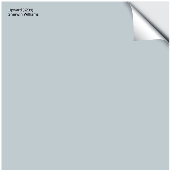
Upward by Sherwin Williams (SW 6239) is a soft blue with gray undertones. LRV: 57
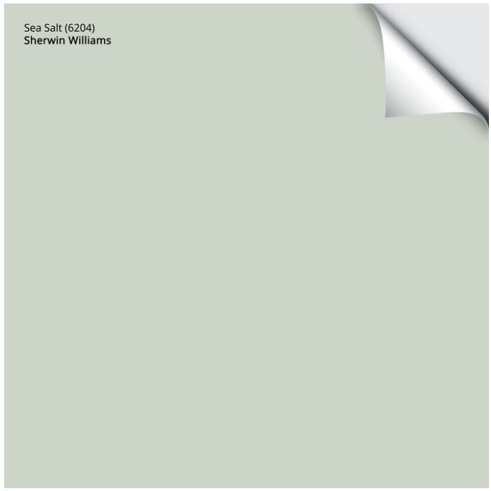
Sea Salt, by Sherwin Williams is a cool, muted green with blue undertones. LRV: 64
The best paint colors for homes with honey oak trim or cabinets are shades that feel balanced and modern rather than overly golden or heavy. One of the most common questions I get is, “Can I use gray paint with oak trim?” The answer is yes, but not all grays work the same way. Many gray paints lean cool and have blue, green, or violet undertones, which can make the orange tones in honey oak stand out even more.
Instead, look for softer, earth-inspired neutrals with subtle warmth and balanced undertones. Think gentle greige tones, muted greens, and warm neutrals that feel grounded and natural rather than overly golden or too deep. These types of colors complement the warmth of honey oak while helping the space feel more current and updated.
These warm gray colors can offer a subtle, cozy vibe that complements the oak’s natural warmth without overwhelming it, creating a space that feels both refreshed and welcoming. Such greys often have undertones of beige, yellow, or red, which harmonize beautifully with the golden notes in your oak trim or cabinets. This blend of slightly cool yet warm-toned greys allows you to modernize your space while maintaining a touch of traditional coziness, bridging the gap between contemporary chic and classic warmth. This makes them particularly effective for those looking to update their home in a way that feels both timely and timeless.
Warm Gray Paint Colors That Work With Honey Oak:
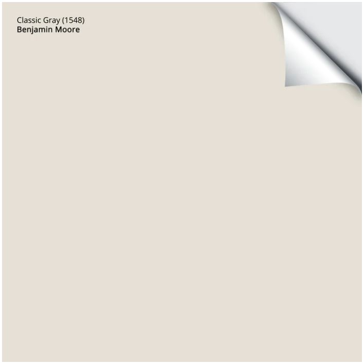
Benjamin Moore’s Classic Gray is an ultra-light shade of gray that can also function as an off-white. LRV: 73.67
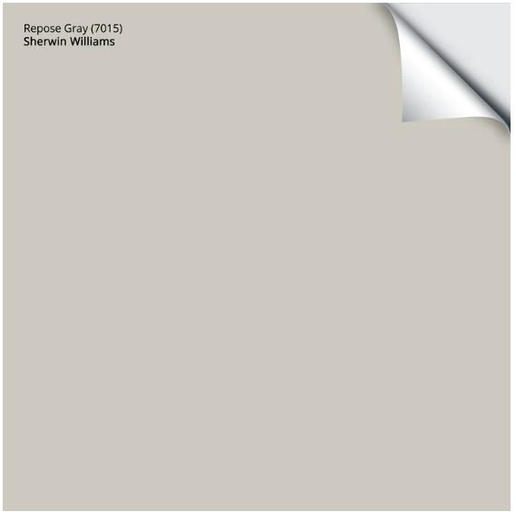
Repose Gray, by Sherwin Williams is a greige color that leans warmer with brighter light conditions. If you have a north-facing space, I don’t recommend Repose Gray it looks a bit cooler and even may show a touch of a purple undertone.
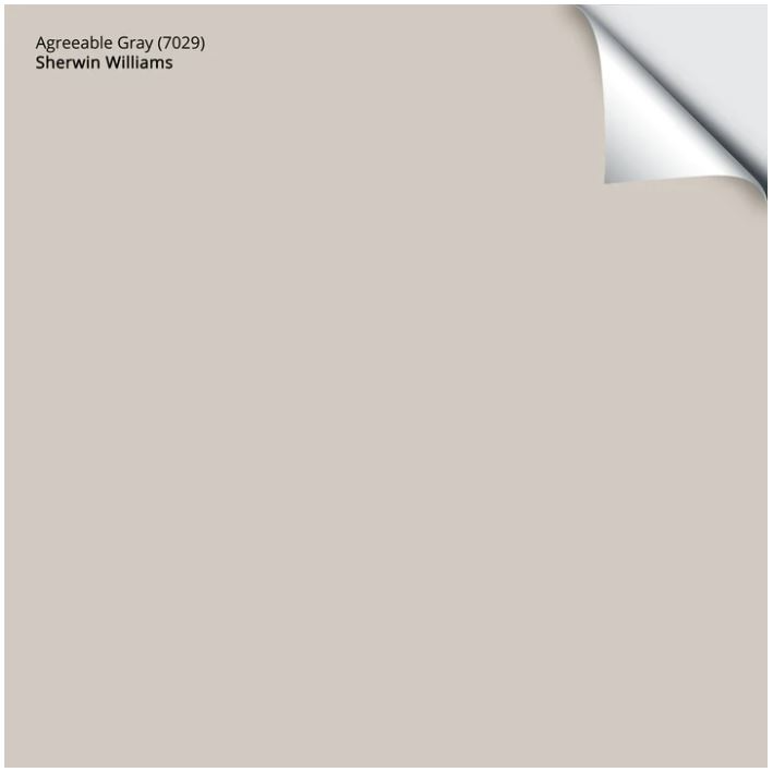
Sherwin Williams, Agreeable Gray is a favorite of mine for so many reasons. It’s a lovely warm greige paint color with green undertones. It looks great in rooms with lots of natural or artificial light. LRV: 60
RELATED:
So, to evoke the warmth you crave, simply go for a beige or gray paint color with brown undertones or “greige” paint color. Steer clear of beiges or grays with cool pink undertones, these will fight with yellow-toned woods and orange-toned woods. This way, it will be the perfect balance in an oak-filled home.

Designer Resource
Still Not Sure Which Color Works Best With Honey Oak?
Choosing a single paint color is only part of the equation. These designer palettes show coordinated wall colors, whites, and accents designed to work beautifully with honey oak cabinets and trim.
Tip #3: Don’t Be Afraid of the Dark
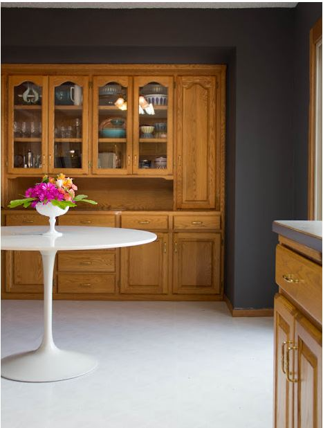
Think you can’t go for ultra-contemporary paint colors just because you need to “brighten up” your oak-filled home? Think again! Dark colors work like a charm with oak, giving your home a dramatic splash of modern design. Just remember to avoid traditionally 90s-era paint colors that feel too earthy like burgundy, sage, and beige. Opt instead for warm grays like charcoal, dark blues, and greens. They’ll give each room a dose of personality and pizzazz.
Modern Paint Colors That Work with Honey Oak Trim or Cabinets
Modernizing a home with honey oak trim or cabinets often comes down to choosing paint colors with balanced undertones. Soft warm whites, greige tones, muted greens, and subtle blue-grays can all help reduce the orange appearance of honey oak while still complementing the natural warmth of the wood.
Dark and Dramatic Paint Colors That Work With Honey Oak:

Salamander by Benjamin Moore is a rich dark green color with deep blue and green undertones. LRV: 3.66

Tip #4: Contrast with Complimentary Colors
Contrasting color schemes make a room feel balanced and visually interesting.
When choosing the best paint colors for honey oak or other wood tones, contrast is essential. You can opt to go dark with a navy or black or to brighten up your oak with a crisp or creamy white or grey. Just make sure you choose a paint color that stands apart from that warmer wood and stay away from gold, orange or red tones. Light colors work beautifully. This will help to enhance its best features.
Contrasting Paint Colors That Work With Honey Oak:
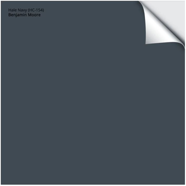
Despite Benjamin Moore’s Hale Navy having primarily gray undertones, it still maintains its true navy-blue color. It does have the slightest hint of green undertones as well. The tiny bit of green in this dark navy keeps it from leaning into a purple undertone. LRV: 8.36
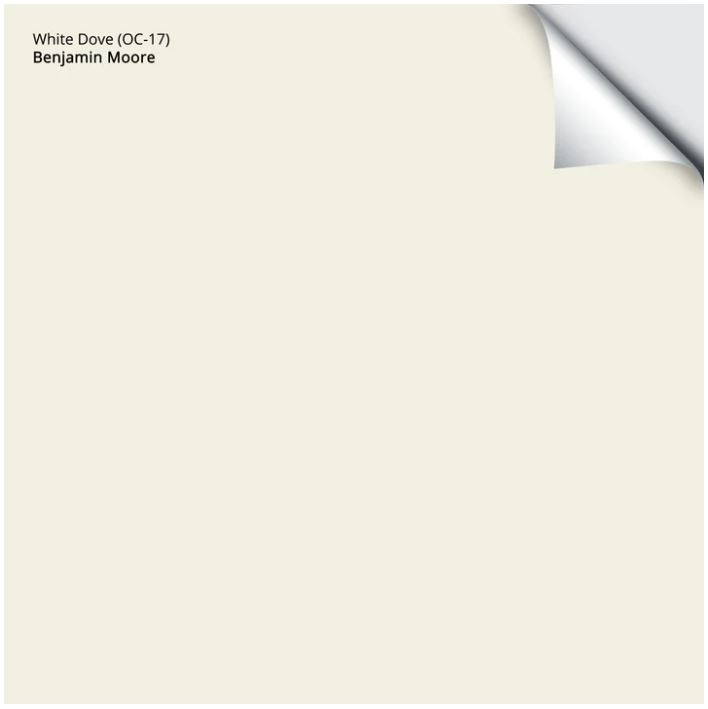
If you’re considering white for your walls in your honey oak kitchen, Benjamin Moore’s White Dove is one to try. White Dove is a clean classic off-white with creamy undertones. LRV: 83.16
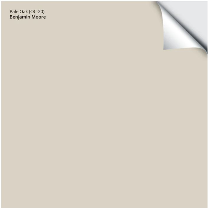
Pale Oak by Benjamin Moore is another favorite to consider when working with honey oak. It’s a very light greige, looking a bit like a deep cream without yellow undertones. LRV: 69
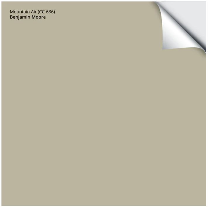
Benjamin Moore’s Mountain Air is a medium grayish green hue, very earthy. If you like an updated look using earth tones, this is one to consider. LRV: 53.58
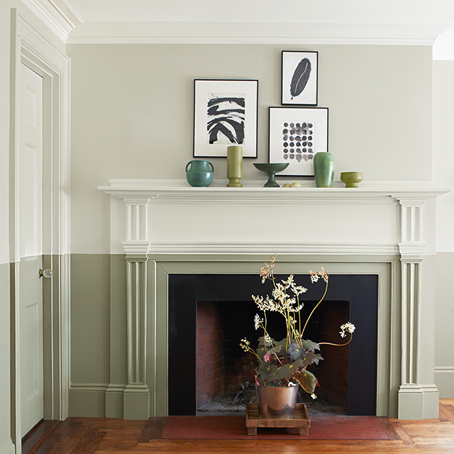
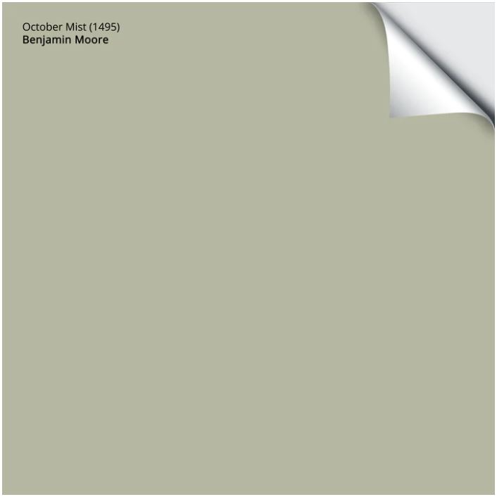
October Mist by Benjamin Moore is a soft green-yellow sage color and Benjamin Moore’s Color of the year in 2022. LRV: 46.54 Read my review on this still popular sage green paint color HERE.
Amazing Paint Colors that go with Oak Wood Trim and Cabinetry
Got the inspiration you need to choose the perfect color for your 1990s home? Ready to tackle it yourself, but not quite sure where to start? Go ahead and pin the image below. It’s our simple no-fuss roundup of our favorite paint colors to complement warm wood tones for a modern look.
Pin this for easy reference:

Many of my posts contain affiliate links. If you click on an affiliate link and purchase something, I may receive a small commission at no additional cost to you. The affiliate money I earn helps pay the fees to keep this site up and running. You can read our disclosure statement here. Thank you so much for your support.
RELATED:
FAQs About Paint Colors for Honey Oak Trim or Cabinets
Q. What’s the best way to test paint colors with honey oak?
Look no further than SAMPLIZE! Using a peel and stick paint sample is cleaner, easier to use, more affordable, AND a bit more environmentally friendly. Samplize makes it easy to observe paint colors throughout the day as the natural and artificial light changes the way color appears.
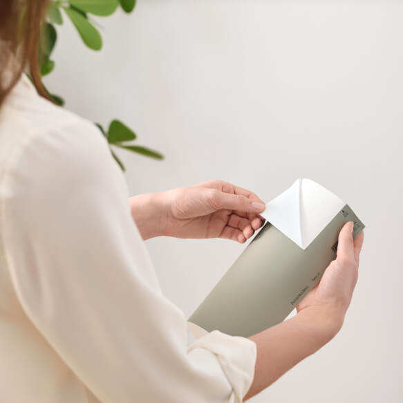
Here’s why I recommend SAMPLIZE to my clients:
1. Cost-Effective: They’re more budget-friendly than traditional methods, which often require purchasing sample pots, rollers, and tag boards.
2. Easy to Use: Keep your Samplize samples on their white paper backing and you can effortlessly move them around the room to see how they look in different lighting conditions.
3. Speedy Delivery: Samplize samples arrive at your doorstep in just one day, depending on your location.
Visit the SAMPLIZE website HERE to explore their range of options.
Q. What is the right paint finish for a room with honey oak?
Choosing the right paint sheen is crucial for any room, not just those with honey oak. A matte or eggshell finish is often best, as it minimizes shine and is washable. These finishes also help hide imperfections on the walls.
Q. What paint colors go with honey oak floors?
Only working with a honey oak stained floor, such as in a living room? The same principles apply that I have outlined here in this blog post, however, with the floor being on a horizontal plane it gives you a bit more flexibility with color. Don’t be afraid to be a bit more bold.
Q. What paint colors make honey oak look less orange?
Paint colors with balanced undertones, such as soft greiges, warm whites, and muted greens, can help soften the orange tones often found in honey oak cabinets or trim.
Q. Can you update a home with honey oak without replacing it?
Yes. Updating wall colors, lighting, countertops, and flooring can dramatically modernize a home while still keeping the original honey oak trim or cabinetry.
Q. Should trim be painted if you have honey oak cabinets?
Many homeowners choose to keep honey oak cabinets or trim and update the surrounding paint colors instead, which helps preserve the natural warmth of the wood while creating a more modern feel.
Thanks for checking out this article! I hope it’s given you a good jumping-off point for picking out paint colors that may work well with your space. Keep in mind, though, that these suggestions are just a starting point. The best way to know for sure what works in your home is to test out these paint color ideas with samples. Consider how they look with your current countertops, backsplash, adjacent spaces, and so on.

Designer Resource
Want a Clear Starting Point for Your Honey Oak Home?
If you’re working with honey oak cabinets, trim, or flooring, choosing the right palette makes everything feel more updated.
Let me know in the comments what color you chose!

Hi, I’m Carla

I’m glad you’re here! You are in the right place if you are feeling overwhelmed at the thought of embarking on a remodeling or interior design project. Living with an outdated home and don’t know where to start? I’ve helped families like yours update their home and create spaces that reflect what’s important to them for over 25 years.
I’ve been honored to be featured in:
Real Homes
The Spruce
Apartment Therapy / Cubby
Twin Cities Luxury + Fashion
MSP Magazine
Minneapolis Star Tribune
Hunker
Home Crux

Modernizing Your Oak
or Wood Kitchen
Free Paint Guide

5 Tips for Stress Free Remodel
Don’t miss a thing!
Enter your email below to be the first to know about design posts, new products and tips for a more beautiful home.
Don’t miss a thing!
Enter your email below to be the first to know about design posts, new products and tips for a more beautiful home.



29 Responses
Hello. I have oak trim – oak color kitchen cabinets and oak color blinds!
Holly way too much oak!!! Help. What color would you paint the kitchen cabinets? Or… would you paint the walls?? The walls are not a Manila ugly yellow/beige? I do like the color paint white dove. Any suggestions would be greatly appreciated! Love your website. Thx Carla
I love Benjamin Moore White Dove and actually did my own in this color! You also paint the walls too to give it all a fresh update, but use a color on the walls that contrasts the White Dove.
Go Bold! Chelsea gray ( sherwin Williams) looks great with oak!!
I also have a whole hose full of honey oak. It is a creams now and needs to be brightened up. My painter uses Sherwin Williams. Any suggestions on something that will lighten my living room/ kitchen up. It does not have to be gray. Thanks
Hello Lanea, There are so many things to consider when choosing a paint color, and without seeing your spaces, it is hard to do. Here is a wonderful guide to help you choose: Paint color Guide
I know SW is Sherwin Williams
What is OC , CC & HC ?
Hi Lauren, Those are colors from Benjamin Moore.
My whole house is honey oak, including trim. Our kitchen, laundry room and hallway is revere pewter, so is the little powder room. However, the powder room seems too dark—what color should I paint it to coordinate with the nearby revere pewter? Thank you. (I thought about buying more revere pewter and having it lightened at the paint store, but I’m not sure how light to go (25%, 50%?) or whether this is the best way to go. Thanks!
Hello Tecero, Without seeing your bathroom fixtures, possibly the best way to approach this is to haver the paint shop lighten the Revere Pewter by 25 – 50% – hope this is helpful!
I have honey oak floors and I love BM Simply White, which is a warmer white with yellow undertones. Is Simply White a bad idea with these floors?
Hi Lisa, Are you looking to so the Simply White on your walls? I probably would lean towards BM White Dove. It is a little bit deeper and I think won’t look too stark next to honey oak.
I am converting my back room into a vintage themed office. The room has a murphy bed and card catalog that a both honey oak colored. I am looking for suggestions for a deep color as the room has a slider door that faces north. I am also considering painting the trim and ceiling the same color. The hardwood floor will be covered in an indoor outdoor oversized rug once the colors are determined.
Thank you in advance for your suggestion.
Hi Debbie, Sounds like a fun project! My suggestion would be to select the rug first and then determine the paint colors after to coordinate with it. If you are a member of the Facebook Group “Interior Design & Remodeling Talk” you can post a picture of your rug and room and we’ll give you some suggestions to sample for paint colors.
Honey oak floors. The trim seems to be white Dove. Can’t decide on a wall color to update. Pale oak, revere pewter,Manchester tan. No too dark. Suggestions ?
Hi Sally, My suggestion would be to select an item for the space that you have or are looking to purchase such as an area rug or piece of art and use as a jumping off point and the base for your room palette. Then determine the paint colors after to coordinate with it. ALways choose your paint color last. If you are a member of the Facebook Group “Interior Design & Remodeling Talk” you can post a picture room and your inspiration piece and we’ll give you some suggestions to sample for paint colors. It is important to sample the colors first in the different light of day and night. There are so many factors to consider for your specific room. Hope to see you in the Facebook group!
Hi Carla, my whole house on the main floor is literally honey oak colored wood. I live in a log home that the ceilings, walls, trim, floors and kitchen cabinets are all the same…the kitchen cabinets I think may be maple and are a hair lighter than all the other wood. The living room, dining room and kitchen are all one room with 14 windows, so there is a lot of light. I am looking to replace the countertops and floor in the kitchen area since it is ugly tile that does not look good with the wood color. I am also wanting to paint the kitchen cabinets but having a hard time deciding on a color. Thank you for any suggestions.
Hi Kimberly, My suggestion would be to select your wood flooring and countertops to establish the base for your room palette. Then determine the paint colors last. If you are a member of the Facebook Group “Interior Design & Remodeling Talk” you can post some pictures for feedback and we’ll give you some suggestions. It is important to sample the colors first in the different light of day and night. There are so many factors to consider for your specific room. Hope to see you in the Facebook group!
Hi Carla, I have honey oak throughout most of the house except the kitchen, bathrooms (1 upstairs, 1 downstairs), and our sunroom/office area. What color tile would you suggest to put next to the honey oak? We have to tile 3 rooms next to honey oak on the first floor, and we’re currently working on the sunroom first. Should we pick the same color tile or same tile for the kitchen, bathroom, and sunroom since they’re all off the living room? I’m feeling overwhelmed with choices. Thanks!
Hi Patrice, My suggestion would be to select tile that will be neutral enough to flow through the spaces, and to use pops of color for accents only to set apart each space. Many greige colored tiles work beautifully with oak tones because they are warm yet bring in some shades other than brown. There are so many factors to consider for your specific rooms, so be sure to join the Facebook Group “Interior Design and Remodeling Talk” if you haven’t already so you can post images for more feedback. Also, stay tuned to my blog for a post on greige tones later this week!
I am remodeling a 1920’s house and the floors have been stripped and refinished. They lean more towards a honey oak. I’d like to paint the ceiling, walls and trim all the same color of white and paint the doors a dark charcoal. I’m going to take your suggestion and use “White Dove” on the walls and trim. What color of charcoal gray do you recommend?
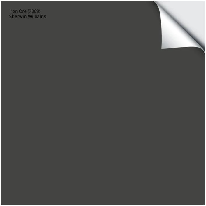
Hi Marta! Thank you for your comment/question. One of my favorite charcoal colors is Iron Ore by Sherwin Williams #7069! It is slightly off-black and looks beautiful with the colors you are talking about.
Hi Carla!
Our house was built in 2000 and has honey oak trim, oak wood floors on main level & cabinets throughout. Is it ok to mix white kitchen cabinets with oak trim? I’ve always wanted white cabinets but I’m afoot won’t look ok not having white trim. I saw some great updates with stair rails and banisters that mixed white with oak also. Your input is greatly appreciated!!
Hi Heather, Thank you for your question! The answer is yes, in fact this is how I had it in my previous home! The important key here is to choose a white that isn’t too cool in tone such as Benjamin Moore White Dove or Swiss Coffee. Good luck with your project!
Hi. I have the 90s honey oak kitchen cabinets. The countertop is a darker grey with beige flecks through it and my trim is white. I do have a larger window so I do get quite a bit of natural light during the day. What would your suggestion be for a wall color.
Hi Jen, If you’re looking for a neutral color, I would get a few samples of some of the shades that appeal to you from our blog post: “Best Paint Colors for Your 90s-Era Home” and look at them in different lighting (day and night) next to your countertop. It is important that the shade doesn’t fight with your countertop shade, as grey can have cool or warm undertones and your paint color should have the same undertones. If you haven’t already done so, you can sign up to receive “How to Choose Paint Colors with Confidence” and learn more! Just scroll down to the bottom of the home page and you’ll see where to get it!
Hi Carla,
What do you think of using Pure White by Sherwin Williams against honey oak trim in a south facing living room with 20-ft vaulted ceilings? We’re hoping for a more modern look.
Hi Monika- Pure White, by Sherwin Williams has a very slight, soft, passive warmth to it, and it picks up the colors surrounding it. I think that’s a top pick for a white wall with honey oak in any lighting!
Hi Carla,
The kitchen cabinets that you refer to as creamy white, what color of paint do those have on them? I have a white oak island and want the other cabinets to be a warm white color. What is the warmest white you’d recommend?
Hi Rebecca – Thank thank you for your question! White Dove OC-17 by Benjamin Moore is a nice warm white. I do suggest ordering a real paint sample (peel and stick) of that as well as a few others options such as: Sherwin-Williams’ Creamy (SW 7012), Benjamin Moore’s Swiss Coffee (OC-45), and Sherwin-Williams’ Alabaster (SW 7008), Here is the link: https://samplize.com/?cjdata=MXxOfDB8WXww&cjevent=d279b4e584a411ee83f2b21e0a82b838&utm_source=CRB%20Design%20Inc.&utm_medium=affiliate&utm_campaign=general&utm_content