
Trending New Neutral Colors for your Whole Home

Neutral paint colors remain one of the most popular choices for homeowners. They create a timeless backdrop that works with nearly any decorating style.
Whether you’re choosing a whole-house paint color, updating a living room, or looking for a warm neutral that works with wood floors or cabinets, the right neutral paint color can completely transform your space.
But choosing the best neutral paint color isn’t always easy. Many neutrals look similar on a paint chip. Once they’re on the wall, they can look very different depending on lighting, undertones, and surrounding finishes.
In this guide, I’m sharing some of my favorite designer-approved neutral paint colors. These include warm greiges, modern beiges, and soft whites that work beautifully in today’s homes.
These shades are especially helpful if you’re working with existing finishes like oak, maple, cherry, or brown wood tones. They help create a cohesive color palette throughout your home.
As an interior designer, neutral paint colors are some of the most requested palettes I help homeowners choose. They create a flexible backdrop that works with flooring, cabinetry, and furnishings, making them one of the easiest ways to refresh a home without committing to bold color.
DESIGNER RESOURCE
Designer Color Palettes for Real Homes
Choosing paint colors is harder than it should be – lighting, flooring, and wood tones change everything. These designer-curated palettes show coordinated wall colors, whites, and accents so everything works together beautifully.
Explore the Designer Color Palette Collections→

What are Neutral Colors?
Neutral tones are muted shades that appear to lack color but often have underlying hues that change with different lighting. You may see hints of warm undertones, green undertones, or yellow undertones. Examples of neutral colors include beige tones, greige (grey and beige blend), taupe, cream, and white. Neutral colors are not on the color wheel, but they complement your favorite colors. Primary and secondary colors (on the color wheel) are great for accent walls and accessories in your interior spaces! Read on for some of my favorite neutral paint colors!
Paint your walls a neutral color scheme and you’ll have the perfect palette for decorating.
Choosing a neutral shade may seem simple. The truth, however, is that it’s much more complicated. For every neutral paint color, there are hundreds of similar neutral colors that have slight differences in undertones. Selecting the wrong one can be disastrous. If you’ve ever selected a white paint, then painted the room and instantly realized it was more of a purple, well, you know exactly what I mean.
Interior designers been choosing neutral paint colors for years, so we know how to choose the perfect neutral paint color for any space. We’ve pulled together a roundup of a few favorites with a few inspirational rooms, too!
Pin this for easy reference:

How to Choose the Right Neutral Paint Color
Choosing the right neutral paint color isn’t always as simple as it seems. Many neutral colors look similar on a paint chip but can appear very different once they’re on the wall depending on lighting, undertones, and the finishes already in your home.
Warm wood tones like honey oak, maple, and cherry often work best with neutral paint colors that have balanced warm undertones, while homes with cooler finishes such as gray flooring or marble countertops may look better with neutrals that lean slightly cooler.
Understanding how undertones interact with your existing finishes is one of the most important steps in choosing a paint color that will feel cohesive throughout your home.
RELATED: Best Paint Colors to go with Honey Oak Trim or Cabinets
Sherwin Williams Neutral Colors
Sherwin-Williams – Agreeable Gray
Agreeable Gray by Sherwin Williams is a versatile and sophisticated neutral paint color. This warm, soft gray with beige undertones, often referred to as “greige,” seamlessly blends into a variety of design styles, from modern to traditional. Its balanced hue of warm greige makes it an excellent backdrop for any room in the house, offering a serene and inviting ambiance without overwhelming the space.

Whether you’re refreshing a single room or painting an entire home, Agreeable Gray’s ability to complement both warm and cool color schemes ensures it harmonizes effortlessly with existing décor, making it a favorite among designers. It’s truly one of the most versatile neutrals.


Designer Tip
One mistake I often see homeowners make when choosing neutral paint colors is focusing only on a small color chip rather than the undertones. A neutral paint color that looks beige in the store can appear green, purple, or gray on the wall depending on lighting and surrounding materials.
That’s why it’s always important to test paint samples in your own space before committing to a color.
Sherwin-Williams – Dovetail
Ready to go bold, but still want a neutral tone? Dovetail may be the shade for you. It’s a warm and saturated gray that is absolutely gorgeous! This warm deep gray color is especially rich with a contrast of fresh white cabinetry or trim. It’s ideal for spaces that you want to feel cozy and ultra-comfortable, like a basement theater or a master bedroom, as well as a warm inviting color for a kitchen. Dovetail has our vote for one of the best neutral gray paint colors on the deeper side of the spectrum.


Many of my posts contain affiliate links. If you click on an affiliate link and purchase something, I may receive a small commission at no additional cost to you. The affiliate money I earn helps pay the fees to keep this site up and running. You can read our disclosure statement here. Thank you so much for your support.
WHAT’S THE BEST WAY TO SAMPLE PAINT COLORS?
Look no further than SAMPLIZE! Using a peel and stick paint sample is cleaner, easier to use, more affordable, AND more environmentally friendly.

Here’s why I recommend SAMPLIZE to my clients:
1. Cost-Effective: They’re more budget-friendly than traditional methods, which often require purchasing sample pots, rollers, and tag boards.
2. Easy to Use: Keep your Samplize samples on their white paper backing and you can effortlessly move them around the room to see how they look in different lighting conditions.
3. Speedy Delivery: Samplize samples arrive at your doorstep in just one day, depending on your location.
Visit the SAMPLIZE website to explore their range of options.
Get your peel & stick (real) paint sample of Dovetail – HERE!

Sherwin-Williams – Anew Gray
Sherwin-Williams’ Anew Gray is a shade of gray that is reminiscent of foggy mornings and misty afternoons. It’s a hue that feels simultaneously muted, yet fresh. This neutral color is great match for nearly any accent color or texture. Pair it with warm textures, blue, or black, and you’re sure to have a space that feels warm, but not too warm to fall into the beige category.


RELATED: Wilds Overlook Basement Design Finishes and Fixtures

Get your peel & stick (real) paint sample of Anew Gray – HERE!

RELATED: Best Greige Paint Colors
DESIGNER RESOURCE
Not Sure Which Neutral Will Work Best?
Many neutral paint colors look similar but behave very differently once they’re on the wall. These designer palettes show coordinated color combinations so you can choose with confidence.
Browse the Designer Palettes→
Benjamin Moore Neutral Colors
Benjamin Moore – Revere Pewter
Revere Pewter is a stunning warm greige color that manages to retain both the warm undertones of beige and a light gray. It is a fantastic “greige” if you are looking for a gray that is warmer and has more saturation. This shade is one of the most popular neutral paint colors that I’ve used on many projects, and throughout my own home.
Why does it work so well? Well, not only is it beautiful in the common spaces of your home, but it’s also the perfect match for home theaters and bedrooms. It works seamlessly with pops of both lighter and darker colors. If you long for the simplicity of a neutral-based home but aren’t ready to go the beige brown or cool grey route, this is a great choice.


RELATED: Sherwin Williams Universal Khaki – Paint Color Review

RELATED: Sherwin Williams Iron Ore: Paint Color Review
Get your peel & stick (real) paint sample of Revere Pewter – HERE!

Benjamin Moore – Balboa Mist
Because it’s touch lighter than Revere Pewter, Balboa Mist adds a brightness to a space that simply cannot be beat. Especially in rooms flooded with natural light, it’s the perfect way to add a sense of wakefulness to an area. Use this light neutral paint color in rooms where activity is (like a poolside lounge area or a basement bar) – the light hue will feel happy, and extra chic.


Get your peel & stick (real) paint sample of Balboa Mist – HERE!

Benjamin Moore – Collingwood
For a light neutral grey paint color, Collingwood pulls a bit more of a cool tone into the mix. It works like a charm with medium-to-dark grey decor and warm brown accents, so if you’re drawn to classic black and white combos (and shades in between), then you’ll want a can of this color.


RELATED: 23 Best Gray Paint Colors for Cabinets by Sherwin Williams

Get your peel & stick (real) paint sample of Collingwood – HERE!

RELATED: 10 Best Greige Paint Colors for your Home in 2026
Benjamin Moore – Snowfall White
Finally, for lovers of white walls and the crispness of a lighter paint color, Benjamin Moore’s Snowfall White is your cup of tea. It’s not too abrasively bright like you typically see in pure white primers, but it instead has a touch of warmth and a yellow undertone.


RELATED: Simply White vs Chantilly Lace – Comparing Top White Paint Colors
Get your peel & stick (real) paint sample of Snowfall White – HERE!

Benjamin Moore – White Dove
White Dove by Benjamin Moore is is is a bit warmer than Snowfall White, but they both look great in a darker room because of the yellow undertones in both colors. For a completely streamlined aesthetic, these warm white paint colors work particularly well as both wall and trim color together. Adding in pops of color and woven textures to the decor completes the look. This is a lovely neutral color for wainscoting in dining rooms and entryways as well as trim color throughout.

Get your peel & stick (real) paint sample of White Dove – HERE!

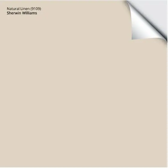
Sherwin Williams – Natural Linen
Beige is making a stylish comeback, and while we’re not fully immersed in it just yet, it’s only a matter of time before it becomes the go-to neutral paint color. That’s why we’re spotlighting Sherwin Williams Natural Linen—a beige that’s bound to top the list in the coming years! Its warm, inviting undertones make it a versatile choice that will keep your spaces feeling fresh and sophisticated as the trend continues to grow.
Natural Linen is certainly a beige paint color, but it stands apart from the golden warm beiges of the early 2000s Tuscan trend and the tan neutrals popular in the 90s. It’s one of the more modern beige tones available today, offering a softer, more versatile warmth that feels fresh and up-to-date.
Get your peel & stick (real) paint sample of Natural Linen – HERE!
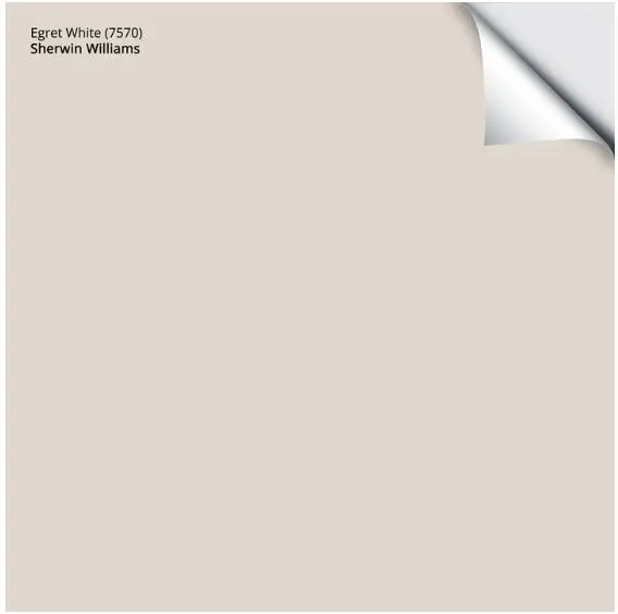
Sherwin Williams – Egret White
Egret White stands out as a versatile neutral with a slightly warm undertone, making it a go-to choice for those seeking an updated neutral look. This shade has a touch of warmth that blends effortlessly with other neutral tones and natural materials, yet remains light and bright enough to open up any room. Its ability to complement both warm and cool design elements makes Egret White a perfect neutral for any space that needs a fresh yet welcoming feel.
Neutral whites like this, with a touch of extra depth, bring an interesting and sophisticated look to your space. Its versatility makes it perfect for various spaces, adding much more character than a stark cool white could.
Get your peel & stick (real) paint sample of Egret White – HERE!
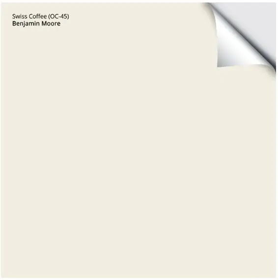
Benjamin Moore – Swiss Coffee
Known for its soft, cream color that exudes warmth and elegance it creates a serene vibe for your space. With it’s subtle yellow, gray, and green undertone, Swiss Coffee offers a warm quality that works well across various lighting conditions.
Swiss Coffee’s versatility makes it suitable for everything from full-room wall coverage to trim accents and cabinetry. This adaptable shade has a way of harmonizing with other neutral tones, making it one of the best new neutral paint colors.
Get your peel & stick (real) paint sample of Swiss Coffee – HERE!
As you search for the perfect wall colors to elevate your family room, kitchen cabinets, or any living space, choosing the right paint color is essential to creating the mood you desire. From warm gray tones to earthy beiges; the best warm neutral paints offer a variety of options. Whether you prefer darker neutrals or true neutral paint colors, the right color palette makes all the difference. With a range of warm colors to choose from, your journey to finding the right paint color will bring elegance and comfort to every corner of your home.
Best Neutral Paint Colors for a Whole House
If you’re looking for a neutral paint color that works throughout multiple rooms, choosing a shade with balanced undertones is key. Whole-house paint colors should transition easily between spaces and complement a variety of finishes.
Many homeowners prefer neutral paint colors like warm greiges, soft beiges, and light warm whites because they provide flexibility when decorating and help create a cohesive flow from room to room.
These types of neutral colors are especially helpful in homes with existing wood finishes, mixed materials, or open floor plans.
Pin this for easy reference:

Paint colors can look very different depending on lighting, surrounding materials, and undertones. I always recommend testing paint samples in your own home before committing to a color so you can see how it changes throughout the day.
Peel-and-stick samples from Samplize make this process much easier because you can move them around the room and view them in different lighting conditions.
Before you purchase a gallon and slap it on the wall, order peel and stick paint samples from Samplize! See it in the room and take inventory of how it makes you feel in a variety of light situations (natural light in the day and night, artificial light, etc.). Once you’ve completed this important step, your room will come together.
Want a Clear Starting Point for Your Paint Colors?
Instead of guessing which colors work together, these designer palettes provide a coordinated system for walls, whites, and accents so your home feels cohesive from room to room.
View the Designer Color Palette Collections→
Still feeling a little apprehensive about choosing between these new neutral paint colors? Here is my free guide to choosing paint colors with confidence.
Frequently Asked Questions About Neutral Paint Colors
Q. What is the most popular neutral paint color?
Popular neutral paint colors often include greiges and warm beiges because they balance warm and cool undertones and work with many different decorating styles.
Q. What neutral paint color works in every room?
Neutral paint colors with balanced undertones tend to work best throughout an entire home because they transition easily between rooms and coordinate with a variety of finishes.
Q. Are beige paint colors coming back in style?
Yes, warmer neutrals and modern beige tones have become increasingly popular again as homeowners move away from cooler gray interiors and look for paint colors that feel softer and more inviting.
Be sure to check out our other paint color reviews for more inspiration.


10 Responses
Carla, These are great neutral color selections and insight. So beautiful.
Thank you, Lisa! I appreciate you taking the time to check it out!
Love all of this information. Beautiful choices.
Carla: I really enjoyed seeing how all of these neutrals look in your actual designs for your clients. It’s so interesting how lighting makes all the difference. I especially love how Revere Pewter looks in that room with the vaulted ceiling and the fireplace. It perfectly ties it all together.
Excellent neutral options, Carla! Revere Pewter is a go-to for me too!
Beautiful colors and examples!
A few of these are new to me, and I’ll definitely be looking them up to add to my rotation. Balboa Mist is an underrated favorite of mine.
Wonderful selections, as well as examples, of these gorgeous colors!
So many great choices here!
Wow, that Anew Gray looks great with the brick wall….matches well with the mortar and the Revere Pewter looks beautiful with the stone in that fireplace.. Nice selections.