
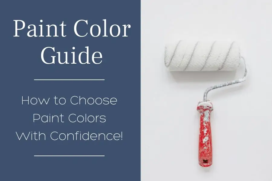
Which Benjamin Moore White Paint is Best?

When it comes to choosing the perfect white paint color, there are many options to consider. There are many different shades of white, ranging from cool and crisp to warm and creamy. It can be tough to narrow down your choices. The difference can make or break your room with each shade of white having a slight difference. So, to get you started in the right direction, I’ve compared two popular white paint colors from Benjamin Moore side-by-side. Simply white vs Chantilly lace! I’m sharing my thoughts on each one of these favorite white paint colors, plus a few other white shades.
So, whether you’re looking for a crisp, clean look or something a little more warm and inviting, read on. Here’s my take on Simply White vs Benjamin Chantilly Lace Benjamin Moore paint colors. One of these may be the perfect choice for your own home!
Quick Take: Simply White vs Chantilly Lace
If you’re deciding between these two whites, here’s what actually matters:
- Benjamin Moore Chantilly Lace (OC-65) is a crisp, clean white with almost no undertone—it’s one of the brightest whites you can use.
- Simply White (OC-117) is softer and warmer, with a subtle creamy/yellow undertone that keeps it from feeling stark.
- The biggest difference isn’t the color – it’s how they react to your lighting and existing finishes.
- Both are high LRV whites (over 90), so they’ll reflect a lot of light – but they won’t behave the same in your home.
If your space already has warmth (like wood tones), this decision matters more than you think.
Pin this for easy reference:

Why These Two Whites Look So Different in Real Homes
This is where most people get tripped up.
It’s not just about choosing a “pretty white” – it’s about understanding what’s behind it.
Undertones (This is what actually makes or breaks it)
- Chantilly Lace: very subtle cool/neutral undertones
- Simply White: soft yellow warmth
That might sound minor, but in a real space? It changes everything.
If you’ve got:
- Honey oak cabinets
- Warm flooring
- Creamy countertops
Simply White will blend more easily… while Chantilly Lace can start to feel too crisp.
First, there are three things you should keep in mind when choosing a white paint color:
- The color Undertone
- LRV (Light Reflective Value)
- How the color will look in Natural Light and Artificial Light.
What is an Undertone Color?
Paint Undertones: A helpful guide to what they are and why you should care.
So, you’ve narrowed down your paint chips to two or three perfect colors standing there in the paint store. Then, once you get the paint on the walls, you realize it looks entirely different than you anticipated. The paint undertones are to blame! These are the subtle hues that can be found within a paint color. They have a big impact on how that color will look once it’s applied to your walls. To help you out, I’ve put together a quick guide to identifying paint undertones.

Warm Undertones
These include shades of yellow, orange, and red. Colors with warm undertones tend to feel cozy and inviting, making them ideal for living spaces. Warm colors are called such because they make you think of sun and heat. They also make a room appear smaller or closer (just as dark colors do). This is why interior designers often use warm hues in large rooms to make them feel cozier.
Cool Undertones
These include shades of blue, green, silver, and purple. Think of the of a clear sky, waters of the sea or a grassy field. Colors with cool undertones have a calming effect and can make a space feel more modern. However, they can also come across as cold or sterile if overused.
Neutral Undertones
These include shades of brown, gray, and black. As the name implies, colors with neutral undertones are versatile and can be used in any space.
RELATED: Neutral Paint Colors We LOVE and Where to Use Them
To create more interest, mix warm and cool tones in your spaces.
By adding layers of both warm and cool tones as well as blending textures together, you will create a space a feeling of being thoughtful and curated. Although you may be drawn to one element in particular, having too much of that one thing can cause it to get lost in the rest of the room.

Warm vs Cool Whites (Quick Guide)
| Type | What it Means | When to Use It |
|---|---|---|
| Warm Whites | Yellow/cream undertones | Homes with wood tones, warm finishes |
| Cool Whites | Blue/gray undertones | Modern spaces or cooler palettes |
| Neutral Whites | Very subtle undertones | When you want flexibility |
Most homes built in the 80s–early 2000s lean warm – this is why Simply White often feels easier to work with.
RELATED: 13 Fireplace Accent Wall Ideas for Your Home
What is LRV?
“LRV, or Light Reflectance Value, is a measurement commonly used by design professionals – such as architects and interior designers – that expresses the percentage of light reflected from a surface. LRVs range from 0-100, with 100 being pure white and 0 being absolute black.” – Benjamin Moore
Because LRV affects how a color looks in a space, it is VERY important to consider when choosing a color, even a white color. If you want a color to appear lighter, choose a color with a higher LRV. If you want a color to appear darker, choose a color with a lower LRV.

How does light affect paint color?
A very important and often overlooked factor that can affect how a paint color looks in a room is the light. Natural light from windows can make a room feel bright and airy, while artificial light from lamps and fixtures can give a room a cozy, intimate feeling.
If you’re painting a room with little natural light, use brighter colors with a high LRV. This helps to reflect the light and will make the space feel more open. For rooms with lots of artificial light, darker colors can help absorb the light and create a warm and inviting space.
What LRV Actually Means for These Two Whites
Both of these are very bright whites:
- Chantilly Lace: 92.2
- Simply White: 91.7
That’s almost identical—so LRV isn’t what makes the difference here.
Undertone matters more than LRV in this comparison.
Where LRV does matter:
- Dark rooms → higher LRV helps
- Bright rooms → can feel too stark
Benjamin Moore’s Simply White vs Chantilly Lace: A Tale of Two Colors
Pin this for easy reference:

Let’s start with Chantilly Lace OC-65, 2121-70
Chantilly Lace is a popular white paint color because it is incredibly crisp and clean white, with just a very slight touch of warmth. It’s absolutely gorgeous on cabinetry or walls making it a great choice for any space that you want to feel light and airy. Without any distracting undertones, Chantilly Lace is Benjamin Moore’s whitest white paint color.

Chantilly Lace Undertones
The best part about Benjamin Moore Chantilly Lace paint is its versatility; it’s one of the most perfect neutral whites, IMHO. It is easy to see why it is one of the most popular white paint colors. With hard to notice grey-blue undertones, this bright white paint color can be used in any home style without looking too harsh or stark. With that being said, in rooms with lots of natural light, it might be too bright for some.

RELATED: Are White Kitchens Timeless or Trendy?
What is the LRV of Chantilly Lace?
Chantilly Lace is one of the whiter white paint colors, with a high LRV of 92.2. This makes it VERY white!
If you’re looking for an even brighter white, Sherwin Williams High Reflective White SW 7757, may be a good option to consider with an LRV of 93.
SW High Reflective White is a pristine snow-white shade that will bounce light around any space while still feeling sophisticated enough to be used in more refined settings like modern living rooms or sleek dining areas as well as kitchens.

RELATED: 23 Best Gray Paint Colors for Cabinets by Sherwin Williams
Even brighter than High Reflective White is Behr Ultra Pure White, PR-W15. It is the whitest white paint available with an LRV 94.4. These are both great choices to consider when you’re going for a real crisp land bright white look.

RELATED: Best Greige Paint Colors
Here’s how Chantilly Lace will look in different lighting:
Northern Exposure:
In general, north facing rooms have cooler, blue-tinted light, which will in turn give Chantilly Lace a very subtle hint of blue or gray. This can be a great compliment when you have a space with a cooler color scheme such as blues or cooler greys.
Southern Exposure:
Southern light has more of a warm yellow hue to it, which will make colors look slightly less pure than they would in other types of lighting. Chantilly Lace will embrace the warmth and compliment a neutral space.
Eastern Exposure:
If a room faces east, it will be filled with warm yellow light in the morning. However, by afternoon the light will take on a more passive quality and become shadowy. As a result of this transition throughout the day, BM Chantilly Lace paint color also shifts slightly but not significantly.
Western Exposure:
In west-facing rooms you’ll start with a muted, passive light in the morning. As the day progresses, you’ll get the most light during the middle of the day with a warm glow as the sun begins to set. Like eastern exposed rooms, Chantilly Lace will shift slightly depending on the time of day becoming a soft white, but don’t expect a large variance.

Is Chantilly Lace a warm white or a cool white?
Neither! The beauty of Chantilly Lace is that it changes color depending on how much light exposure it gets. If you have north-facing light, the paint might look slightly blue or gray blue. However, if you get south-facing light or afternoon western light, then the paint would appear warmer without being as warm as traditional white paint colors.
Is Chantilly Lace too stark?
No, it’s not a stark white – it’s a soft, simple, clean color. Chantilly Lace is a good choice for trim and cabinets because its clean white look brightens up the room without looking too harsh.

Is Chantilly Lace a good white for walls?
Yes! However, if you choose Chantilly Lace for your interior walls, I recommend using the same shade for your trim and/or cabinets to prevent any contrasting undertones.
Designer Insight: Why Chantilly Lace Sometimes Feels Too Stark
This is something most articles won’t tell you:
Chantilly Lace looks beautiful in photos – but in real homes, it can feel too clean if everything around it is warm.
I see this happen all the time in:
- Honey oak kitchens
- Homes with beige/tan flooring
- Spaces with warmer granite or countertops
It’s not that Chantilly Lace is wrong… it’s that it doesn’t always relate to what’s already there.
Now let’s take a look at Simply White OC-117, 2143-70
If you prefer a slightly warmer shade of white than Chantilly Lace with just a hint of creaminess, then Simply White is an excellent option. As the Benjamin Moore color of the year in 2016, this hue was popular for its ability to transcend styles and trends. Whether you’re looking for a versatile white to use throughout your entire home or you’re trying to achieve a more contemporary look, Simply White can help you achieve your goals.

Simply White Undertones
Simply white has pale yellow undertones giving it a more subtle and calming feel, as opposed to an all-out crisp white tone. Benjamin Moore’s Simply White is an excellent choice if you are looking for a white with some warmth to it without going too deep into yellow tones.

Here’s how Simply White will look under natural lighting conditions:
Northern Exposure:
Simply White is great for rooms without windows or north-facing rooms that don’t get a lot of sunlight because it literally looks light a soft light itself!
Southern Exposure and Western Exposure:
Simply White looks a bit warmer and slightly more yellow-toned than it actually is in south-facing or western exposed rooms.
Eastern Exposure:
If your room is facing east, you’ll be graced with warm yellow morning light and passive afternoon shadows. Painted in Simply White, the colors will shift a little throughout the day from warmer to cooler tones, but not significantly.
RELATED: 13 Best Sherwin Williams White Paint Colors for Cabinets
What is the LRV of Simply White?
BM Simply White is a 91.7 on the LRV scale which is slightly lower than Chantilly Lace. It’s a warmer color than some other whites, making it a good choice for rooms that get a lot of natural light. It’s also a softer white, which can give a room a more calming and relaxing feel.

RELATED: How Much Does it Cost to Paint Kitchen Cabinets?
Is Simply White warm or cool?
Simply White is the perfect balance of warm and crisp, with just a hint of creaminess. With just a hint of yellow, it is an excellent choice for a wide range of projects.

RELATED: The 10 Best White Paint Colors That Go With Oak
Is Simply White too white for walls?
Interior designers love Simply White because it has a clean, crisp look. The high light reflectance value makes a home feel warmer while preserving the appearance of pure white paint – an excellent choice if you want to keep your walls and trim all painted in one shade!
And because it’s such a versatile color, it’s easy to change up your decor by simply swapping out accessories or adding new artwork.

If you’re looking to lighten things up and go for white walls in your honey oak kitchen, I would consider Sherwin Williams Alabaster SW 7008, over Benjamin Moore Simply White.
Alabaster paint is a neutral off-white, similar to Chantilly Lace but with a lower LRV of 82. It’s close to cream, but without the yellow hues. When paired against honey oak cabinets in the kitchen, alabaster can really brighten up the space.

RELATED: Best Paint Colors for Your 90s-Era Home
Simply White vs Chantilly Lace and Other Similar White Paint Colors
So, now that we’ve explored two of the most popular white paint colors from Benjamin Moore, let’s touch on a few other favorites from Benjamin Moore.
Other popular white colors by Benjamin Moore Paints:
Benjamin Moore White Dove, OC-17, with its warm undertones is one of the best white paint colors when you want a want to cozy it up a bit. It is a lovely, soft white with creamy undertones. It is quite versatile for a white paint color, as it plays well with both cool tones as well as and warm tones in your space.

Benjamin Moore Cloud White, OC-130, is a warmer white, meaning it has creamy white undertones. Depending on your light, it can appear more yellow in some instances. For example, Cloud White will look warmer in rooms with south-facing natural light.

Benjamin Moore Super White, OC-152, has a high LRV of 87.36 and gives a very, VERY slight nod to being a cooler white. You won’t see many undertones, however, be careful when painting because this paint will easily pick up color cues from it’s environment.

Benjamin Moore Decorator’s White, OC-149, is a favorite white paint color in the cool whites realm. It has a touch of gray which gives it the ability to reflect blue, green, or purple undertones. The purple undertones, to me, are more prominent in decorator’s white. Because it’s not a true white (LRV: 82.68), I would only consider using this shade in a separate room versus your whole house.

No matter what type of light you’re working with, taking some time to view a real paint “stick sample” from Samplize and view at different times of the day to help you find the perfect shade for your home. Paint colors will reveal undertones you may not see in the paint store lighting but will see in real life!
Many of my posts contain affiliate links. If you click on an affiliate link and purchase something, I may receive a small commission at no additional cost to you. The affiliate money I earn helps pay the fees to keep this site up and running. You can read our disclosure statement here. Thank you so much for your support.
WHAT’S THE BEST WAY TO SAMPLE WHITE PAINT COLORS?
Look no further than SAMPLIZE! Using a peel and stick paint sample is cleaner, easier to use, more affordable, AND more environmentally friendly.


Here’s why I recommend SAMPLIZE to my clients:
1. Cost-Effective: They’re more budget-friendly than traditional methods, which often require purchasing sample pots, rollers, and tag boards.
2. Easy to Use: Keep your Samplize samples on their white paper backing and you can effortlessly move them around the room to see how they look in different lighting conditions.
3. Speedy Delivery: Samplize samples arrive at your doorstep in just one day, depending on your location.
Visit the SAMPLIZE website HERE to explore their range of options.

Get your (real paint) peel & stick paint samples of Simply White, Chantilly Lace and more – HERE!
Frequently Asked Questions About Simply White vs Chantilly Lace
Can I use the same white on walls and trim?
Yes – and it’s often the easiest way to get a clean, cohesive look. If you’re using a color like Benjamin Moore Chantilly Lace, this works especially well because it keeps everything consistent. For the best result, use a matte or eggshell finish on the walls and a semi-gloss on the trim – this gives you subtle contrast without changing the color.
Why does Simply White sometimes look more yellow than expected?
Because it is a warm white – and lighting can amplify that. South-facing light especially will pull out more yellow, which is why sampling is so important.
How do I choose between Simply White and Chantilly Lace?
It comes down to this:
Choose Chantilly Lace if you want a crisp, clean white and your home leans neutral or cool.
Choose Simply White if your home has warmth and you want a softer, more blended look.
What to Remember Before You Choose
- Undertone matters more than brightness
- Your existing finishes should guide your choice
- Lighting will change everything throughout the day
- Chantilly Lace = cleaner, crisper
- Simply White = warmer, softer
The goal isn’t to pick the “best” white – it’s to pick the one that works with your home.
DESIGNER RESOURCE
Still unsure which white is right for your home?
Choosing between Simply White and Chantilly Lace is just the beginning – what really matters is how it all works together with your cabinets, flooring, and lighting.
That’s exactly what my Designer Color Palettes are built for.
They give you complete, coordinated color direction—so you’re not second-guessing every decision.
Browse the Designer Palettes→

So, there you have it! What are your thoughts on my take on Simply white vs Chantilly Lace? No matter which white paint color catches your eye, there’s no doubt that all these gorgeous options will help turn your home into a beautiful oasis where comfort and style reign supreme! Happy painting!


13 Responses
I have a southern exposure home I don’t want a stark white . Do you feel super white or Chantilly is more stark? I love simple white but for some reason it’s reading yellow but that may be the fact that my current walls are yellow and when I put the sample up it’s reflecting.
Hi Lisa-
Thank you for your comment! According to the LRVs of these two colors, Chantilly Lace is a bit brighter, although I wouldn’t call it “stark.” Simply White does have a little bit of warmth to it and a southern exposure will bring this out even more.
I have an east facing kitchen with double glass doors and a window over the sink. My floors are gunstock oak color and shiplap walls that are painted alabaster. I am having new cabinets built. Which paint color would look best, chantilly lace or white dove for the cabinets? I’m hoping to do the counter tops in a white quartz that has a soft muted light gray tone called Calacatta Dove 3 CM 6023 and backsplash is a honed marble tile called Casa Blanca Carrara. Thank you for any advice you can give me.
Hi. I am in an apartment without a lot of windows and face southwest. My goal was to open it up a but in here so its not so dark. I currently have both Chantilly lace and simply white swatches painted all over the place. My husband said they are too chalk like for his taste. Can you make a suggestion for something just a tiny bit warmer and cozy without turning yellow? We also have white cabinets, white subway tile and white moldings so I’m afraid of making the paint appearing dingy. That’s what happened with the current greige they painted in here. Thank you!
Hi Melissa,
I think the white you already have there, as well as the southwest natural light is what’s bringing out the yellow undertones. Have you tried Sherwin Williams Pure White? It has very little undertones!
I loved this comparison of Simply White and Chantilly Lace! Your insights on the undertones really helped me see how they can change a room’s vibe. I’m leaning towards Chantilly Lace for my living space now! Thank you for such a helpful post!
Would you consider pairing Chantilly Lace on walls and ceiling with black trim and baseboards?
Hi Amy- Thank you for your questions. Yes, I think that combination would be lovely!
I loved this comparison between Simply White and Chantilly Lace! It’s so insightful to see how the undertones can really affect the overall look. I’m leaning towards Chantilly Lace for my space. Thanks for the helpful breakdown!
I absolutely loved this comparison! Both Simply White and Chantilly Lace have their unique charm, but I can see why Chantilly Lace is often favored for its crispness. Your insights on the undertones really helped clarify things for me. I’m definitely leaning towards Chantilly Lace for my upcoming project. Thank you for sharing!
Hello. I have Honey Oak (almost Golden Oak) built in bookshelves in our family room with Sherwin Williams Accessible Beige painted walls. At first I was thinking about having the oak built ins redone in white but with all the grainy streaks and wood knots in the cabinet doors fear it’l be a huge project to do and very costly with a professional painter. We are not able to afford a whole new set of built ins. I thought if I just painted the room with a brighter pallet than the Accessible Beige it would refresh the space and then I’d add color with plants and accessories. Am I doing the right thing? (I will add that the built ins are very good quality which the previous homeowner put in so if the paint will solve the refresh issue that’ll be great!) I love Chantilly Lace but also like Pure White. Which would go better for the refresh to offset the oak cabinets? Thank you.
Hi Gail- Thank you for your comment and question!
I would not add a brighter wall color, this will probably make your built-ins pop out more. If you want to leave them as is, check out this article to find the perfect tone for your space: https://carlabast.com/best-paint-colors-for-your-90s-era-home/
Or this if you’re looking for a white: https://carlabast.com/white-paint-colors/
I would keep the walls neutral, and add updated accessories, wall art, and decor. You could also check out my Honey Oak (Golden oak) Palettes for coordinating accent colors: https://carlabast.com/product-category/color-palettes/
If you’d like, I’d love to see before and after photos – you can send to me at carla@carlabast.com
Good luck with your project!
I loved how you broke down the differences between Simply White and Chantilly Lace! It’s so helpful to see the undertones explained, especially when choosing the perfect shade for a space. Our living room could really benefit from a fresh coat—I can’t wait to experiment with these colors! Thanks for the insights!