Best Summer Decorating Color Palettes for your Home
March 11, 2026
Inspiration for Summer Decor in 2026
If there’s one thing that tends to define summer season, it’s color. From the bursts of blooms to the vibrant hues of beach balls and swimsuits, there’s no shortage of saturation to marvel at. Yet, as bold and whimsical as those shades are, it can be a challenge finding which one is the perfect color palette for your home. To help you narrow down your search, in this blog post, I’ve pulled together a few of my favorite summer color palettes for decor. From bright colors to lush greens, I’ve got unique color schemes and color inspiration for summer to fit every style.
Pin this for easy reference:

Textured Neutrals
For the neutral lovers who prefer to keep things simple, crisp, and clean, you can still enjoy the essence of summer in your home’s palette. Simply take inspiration from the colors you see around you in nature. While we love tossing a bold black into the mix for contrast, it’s also key to incorporate plenty of beiges, creams, and wood-colored hues. That way your space will feel like it was plucked right from the outdoors – and just in time for summer!

RELATED: Neutral Paint Colors We LOVE and Where to Use Them


Sky Blue and Water Hues
Blue is a classic color that, frankly, never gets old in the world of interior design. And considering just how many blue hues you’re around in the summer, it’s an easy choice to make. Pull your inspiration from the different blue hues found in nature.

Whether the deep blue of a moody ocean or the hue of a clear blue sky. Layering a few different shades will ensure your space feels not only season-ready, but also calm and tranquil.

RELATED: Benjamin Moore Hale Navy: Paint Color Review

Sandy Beaches
For the beach lover, incorporate sandy beach colors into your home to capture the essence of summer. Think warm tones of beige and tan, along with shades of blue and blue-green. Bring in furniture pieces made of woven natural elements. Use sea grass, rattan, sea shells, and textures reminiscent of beachside hammocks, and driftwood.


Incorporate natural elements like driftwood centerpieces or potted plants to evoke the tranquility of a coastal retreat.
RELATED: Mudroom Design Inspiration for the New Year
Sunset Shades
Is there anything more stunning than those summer cotton candy sunsets? Shades of pinks, oranges, and yellows can give your space an instant upgrade and make things feel fresh and new. Just remember that with these colors of summer, it’s important to avoid going overboard – they work best peppered into your home decor (think throw pillows, rugs, or artwork). If you are tempted to go a bit more bold with a new wall color, be sure to choose the right shade so you don’t fall into the hot pink or construction orange realms. Stick to softer, more mellow hues, and you’ll be good to go.


RELATED: Simply White vs Chantilly Lace by Benjamin Moore


RELATED: The Best Modern Lake Home Design Ideas
Lush Greens
Of course, summer wouldn’t be summer without those bold greens we know and love. Wherever you live, green is a sign of vitality and summer life. From the freshly cut lawns of the Midwest to the cactus-covered landscaping of southern California, green is a color that comes in a wide range of hues. Create a lush vibe in your space with plants that encourages tropical-inspired relaxation.

RELATED: The Benjamin Moore Color of the Year – October Mist

RELATED: Sherwin Williams Iron Ore, 7069: Paint Color Review
Vibrant Garden Color Palette
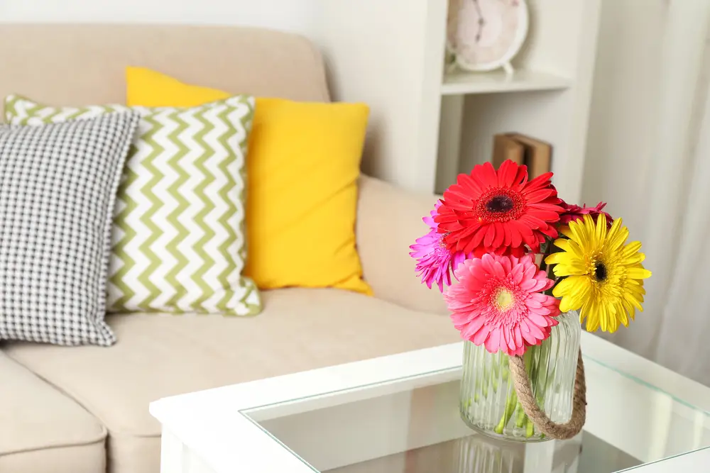
For those craving a burst of energy in their summer decor, a vibrant color palette inspired by lush gardens and summer blooms is a great choice. Whether through accent pieces of furniture, artwork, or lively floral prints, incorporating this vibrant color palette into your decor invites the beauty and vitality of a summer garden indoors.


RELATED: 39 Easy Center Table Decor Ideas (and tips) for your Living Room
Before the summer heat transitions into the cool breezes of fall, give your own space the infusion of color! Whether you opt for the soft pastels of a tranquil summer afternoon, a vibrant colorful garden inspired space, or the sandy hues of a coastal paradise, let your decor reflect the joy and leisure of the season. Embrace the beauty of summer through your choice of these summer color palettes for decor. Then, pour yourself a lemonade, and enjoy the summer!

Hi, I’m Carla

I’m glad you’re here! You are in the right place if you are feeling overwhelmed at the thought of embarking on a remodeling or interior design project. Living with an outdated home and don’t know where to start? I’ve helped families like yours update their home and create spaces that reflect what’s important to them for over 25 years.
I’ve been honored to be featured in:
Real Homes
The Spruce
Apartment Therapy / Cubby
Twin Cities Luxury + Fashion
MSP Magazine
Minneapolis Star Tribune
Hunker
Home Crux

Modernizing Your Oak
or Wood Kitchen
Free Paint Guide
5 Tips for Stress Free Remodel
Don’t miss a thing!
Enter your email below to be the first to know about design posts, new products and tips for a more beautiful home.
Don’t miss a thing!
Enter your email below to be the first to know about design posts, new products and tips for a more beautiful home.


2 Responses
Great post!
This site has everything a décor enthusiast needs! Can you add a section that highlights sustainable and organic materials in décor?