
Open Concept Kitchen – Living Room Transformations for the Outdated 1990s Kitchen
Continuing our 1990s Home Updates series I want to share two recent kitchen renovation projects where our clients wanted an open concept kitchen living room, creating a modern kitchen with additional seating.
90s Home Vibes vs. Today’s Open Concept Kitchen-Living Rooms
The 90s was a decade of many things: Neon clothes, Rachel haircuts, and closed off room floor plans. These closed kitchen designs tended to be darker and feel more cramped. Even worse, they make it difficult for family gatherings, entertaining guests, or to keep an eye on little ones.
In today’s home, having an open space that feels connected – from the kitchen to the living and dining rooms – is much preferred over separate rooms. If you often have a messy kitchen, an open layout may not be for you. However, open concept living gives the illusion of more space, and it makes social interactions easier for the chef! If you’ve got a closed layout in need of an overhaul, read on!
RELATED: Are White Kitchens Timeless or Trendy?
The Gather Around Kitchen
The existing kitchen in this home had a few fairly functional amenities (bar seating and an adjoining dinette space). It felt cramped and too closed off from the rest of the spaces. The wall to the left of the sink blocked the view to the great room. The corner pantry lacked efficient use of space leaving only a small and narrow hallway to get to the nearby dining room.

RELATED: How to Determine Your Kitchen Remodeling Budget
New Design Elements
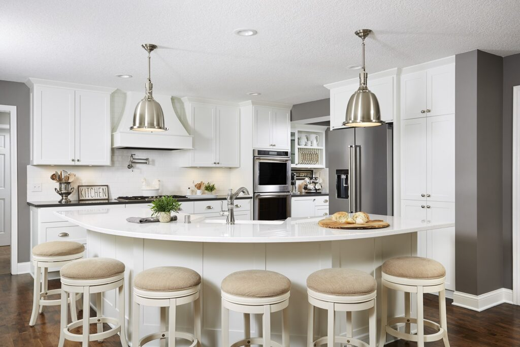
Spacious Curved Island
First, we removed the wall between the kitchen and great room keeping general layout of the space. This allowed us to revamp the peninsula into a huge, curved island that could accommodate our clients’ growing extended family. The original small spaces kitchen island was removed as well, which instantly made the space feel larger and less cluttered. A large, curved island allowed for easy flow throughout the kitchen and living space.
RELATED: 10 Modern Basement Bar Ideas to Entertain at Home
Coffee and Wine Nook Corner
We replaced the original pantry with a much more user-friendly setup. The new design included a new coffee and wine nook (my favorite feature)! Great for every day, and entertaining! This allowed for a seamless transition into the dining room. Keeping to the grey and white neutral color palette, we paired grey quartz countertops with crisp white cabinets. To finish this stunning transformation, we painted a couple of coats of Sherwin Williams’ Dovetail, SW-7018.
BEFORE


RELATED: Foolproof Pantry Organization
The adjoining dining room was only accessible via a narrow hallway due to the placement of the pantry in the original layout, and the load-bearing header was visible just above the doorway.
RELATED: 9 Modern Honey Oak Kitchen Design Palettes with Colors & Finishes


AFTER


RELATED: Simply White vs Chantilly Lace – Comparing Top White Paint Colors
By opening up the previously-closed off pantry space, we were able to provide essential daily function, storage, and a more spacious entrance to the dining area.
We were able to keep the header in place in a visually appealing way by creating a soffit detail and make it appear as an intentional architectural element.
Additionally, the mechanical chase was strategically hidden by the slight bump out in the corner of the coffee nook between both cabinets.
RELATED: Subway Tile Ideas and Inspiration


RELATED: The 10 Best White Paint Colors That Go With Oak
RELATED: 13 Best Sherwin Williams White Paint Colors for Cabinets
Pin this for easy reference:

The Jordan Remodel
As you may have seen from our recent Jordan Project Reveal series, this home was firmly rooted in 1990s-era style. Each of space’s different areas were individually partitioned, cherry trim and cabinets, and heavy built-ins were throughout the space. While the house itself was quite spacious, it didn’t feel that way. Closed off spaces caused a lack of flow between the kitchen and dining room.
An awkward 2-tier kitchen island lacks functionality and further closes off the space. Our clients were looking for an open plan kitchen space for meal prep as well.
The living room, too, felt far too small, enclosed by angled walls, heavy arches, and wood columns. What the space needed was to be opened up dramatically to really take advantage of what it had to offer.
Creating Open Concept Kitchen / Living Room
We made several drastic improvements to create an open kitchen concept. The entire living area space was opened up by removing the walls between the kitchen and adjoining spaces. The main floor instantly felt enormous compared to its previous arrangement. Natural light was able to flow into every nook from the large windows.
The kitchen, too, received a major upgrade with a spacious kitchen island that comfortably seats six. The new patio door creates a smooth transition from the newly-remodeled kitchen to the airy back screened-in porch. The resulting effect was a welcoming and bright space.
BEFORE

RELATED: 5 Signs Your Home is Stuck in the 90s
AFTER

RELATED: Neutral Paint Colors We Love!
BEFORE


RELATED: 90s Decor Trends to Ditch Right Now!


AFTER

RELATED: How to Hang Curtains the Right Way

RELATED: Quartz vs. Granite Countertops, How to Choose the Right One

Transforming a 1990s kitchen into an open concept plan can completely change your home. By removing walls and rethinking the layout, an open concept kitchen living room not only looks better but also works better. This design creates a spacious, welcoming area that’s perfect for daily living and entertaining guests. Whether you prefer modern minimalism or a cozy, eclectic style, an open concept kitchen living room offers endless possibilities. It’s a great way to bring new life to your home, making it more versatile and inviting.
For more 90s-era home updates and inspiration, click HERE.


9 Responses
The before and after are especially thrilling. What talent! The difference is phenomenal and how you can envision that from what you have in front of you is amazing. Great job!!!
Wow beautiful open and airy transformation!
Thank you, Suzi!
Great updates to these two homes – what a difference in both looks AND function!
Thank you, Janet! Our clients are really enjoying their new spaces.
Carla, what a beautiful transformation! I think the way you opened up the space is absolutely brilliant.
These spaces are absolutely beautiful. I may be weird, but I like my separate spaces.
Wow! Gorgeous transformation. What a difference in both looks and function!
Oh wow! I am blown away. What a night and day difference. Your clients must be over the moon!