
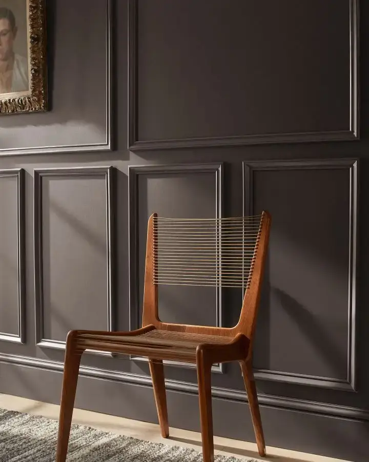
A rich, moody neutral that brings warmth, elegance, and timeless depth
Every year, design lovers eagerly await the reveal of the Color of the Year, and Benjamin Moore’s 2026 selection does not disappoint. Meet Silhouette AF-655, a rich espresso-inspired tone with delicate charcoal (and a smidge of purple) undertones that falls beautifully into the brown color family. This shade feels like a luxurious blend of warmth and depth, offering the perfect balance between a cozy moody hue and timeless sophistication.
Designer Color Palettes for Oak, Maple, Cherry & Other Similar Wood Tones
Created to help you modernize your home without painting or replacing existing cabinets, trim, or flooring, these designer-curated color palettes take the guesswork out of choosing wall colors, whites, and accents that work with real wood tones. modernize your space without painting the cabinets or trim.
Explore the Designer Color Palette Collections→

A Personal Designer Story: Why I Love Moody Warm Shades
If you’ve been here a while, you know I have a deep love for moody hues and warm neutral spaces.
There’s something about a warm, rich color that invites you in, encourages you to exhale, and creates an emotional connection to your space. I’ve seen homeowners shift from choosing “safe” paint colors to embracing layered, soulful tones that make their homes feel thoughtful, curated, and welcoming.
That’s exactly why Silhouette AF-655 immediately spoke to me – it’s dramatic, but soft. Moody, but warm. It feels like stepping into a beautifully lit restaurant or a boutique hotel lobby – undeniably stylish, yet instantly comforting.
Why Benjamin Moore Silhouette AF-655 Stands Out for 2026
According to Andrea Magno, Senior Manager of Color Marketing and Design for Benjamin Moore, this year’s Color Trends Palette embraces a renewed interest in comfort, warmth, and elevated simplicity. After years of cooler grays dominating interiors, homeowners are gravitating toward colors that feel grounded and emotionally resonant.

This shift has been building, and I am very excited about it! There’s a growing interest in earthy warmth, rich espresso tones, and hues that feel lived-in yet sophisticated. The Benjamin Moore team describes Silhouette AF-655 as a shade designed to bring elegance, presence, and balance to the home, and honestly, that sense of grounded calm feels more valuable than ever in today’s busy world.
With subtle notes of charcoal layered into warm espresso undertones, this darker shade feels modern yet timeless. It fits right into today’s shift toward warmer, thoughtful design over fast, disposable trends.
Why Warm Dark Colors Are Trending
There is a clear movement happening in interior design: homeowners are leaning into warmth, depth, and intention. The era of stark whites and icy grays has evolved into a desire for grounding tones with richness and dimension.
Here’s why warm dark shades like Silhouette AF-655 are having such a moment:
- They make a room feel cozy and inviting
- They photograph beautifully while still feeling natural
- They work with layered textures and natural materials
- They instantly elevate a space and give it personality
- They complement organic, artisan-made finishes and furnishings
Warm dark colors are about mood, comfort, and self-expression — and Silhouette AF-655 embodies this perfectly.

Where Benjamin Moore’s Silhouette Works Beautifully
This shade’s handsome midtones, depth and luxurious feel make it incredibly versatile.
Bedrooms
Perfect for creating a relaxing retreat, this moody hue instantly makes a bedroom feel like a boutique hotel suite. Layer it with soft creamy linens, warm brass lamps, and natural textures for a cocoon-like effect that invites you to unwind at the end of the day.

Dining Rooms
In a dining space, Silhouette AF-655 sets the tone for intimate dinners, candlelit gatherings, and meaningful conversation. It feels elegant, grounded, and timeless – a beautiful backdrop for light toned wood tables, upholstered chairs, and glowing sconces.

Library or Study Spaces
Libraries, home offices, and studies absolutely thrive with deeper wall colors. This shade envelopes the room, creating the perfect environment for reading, thinking, and cozying up with a cup of coffee. Think leather chairs, styled bookcases, and soft library lighting – pure luxury!
Cozy Living Rooms
For living rooms where comfort reigns, this color adds depth and warmth without overwhelming the space. It pairs beautifully with natural stone fireplaces, textured rugs, layered throw blankets, and warm wood tones. You get a high-style look that still feels live-able and inviting.

Powder Rooms
A powder room is the ideal place to get bold, and Silhouette AF-655 delivers drama in the most sophisticated way. It transforms a small space into a jewel-box moment, especially when paired with metallic mirrors, statement lighting, and natural accents like light wood tones or stone.

Accent Walls in Open-Concept Spaces
If you’re not ready for a full room of dark walls, use Silhouette strategically on one architectural wall or in a defined zone to ground your floor plan. It helps anchor the space and adds richness and dimension – especially in open layouts.
Interior Doors and Trim
Painting interior doors and trim in a deep, warm color can completely elevate your home. Silhouette adds polish, contrast, and character, giving every doorway a designer-level finish. Pair it with creamy walls for a timeless, high-contrast look.
Built-Ins and Cabinetry
Whether you’re updating a media wall, home office built-ins, or cabinetry in a kitchen or bar area, Silhouette adds refined sophistication. It beautifully highlights millwork details and creates a tailored, custom look — especially with brushed brass or polished brass hardware.

Crown Molding and Millwork
If you have great millwork, let it shine! Painting crown molding, wainscoting, wall paneling, or ceiling beams in Silhouette AF-655 adds architectural presence and luxury to any room. It feels classic, confident, and truly designer-driven.
Designer Tip
Silhouette AF-655 is especially gorgeous when layered with texture. Think natural wood, soft fabric upholstery, warm lighting, and aged metals. Whether you’re drawn to organic modern, modern farmhouse, classic timeless style, or a European layered look, this shade feels right at home.
Silhouette creates depth in large rooms, but also turns smaller spaces into intimate retreats. It draws attention to architectural features and creates a timeless, lived-in sophistication.
Many of my posts contain affiliate links. If you click on an affiliate link and purchase something, I may receive a small commission at no additional cost to you. The affiliate money I earn helps pay the fees to keep this site up and running. You can read our disclosure statement here. Thank you so much for your support.
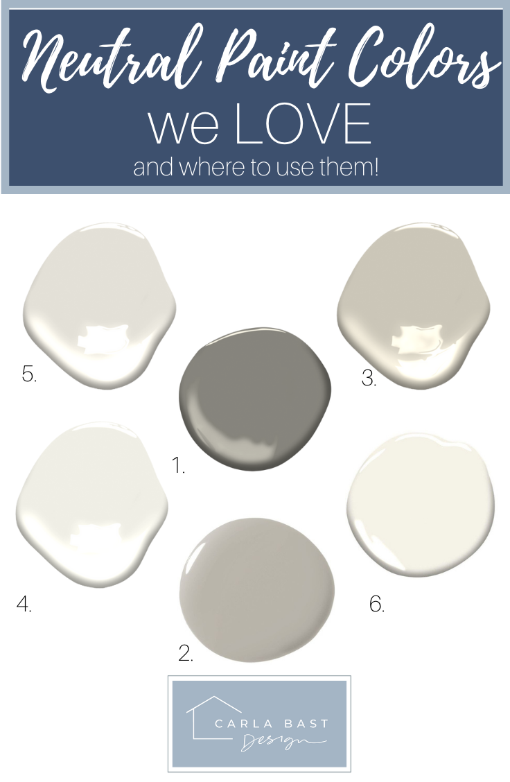
Colors Similar to Silhouette AF-655
If you love the moodiness and warmth of Silhouette AF-655 but want to explore a few close cousins, there are several colors that offer a similar deep, elegant feel. These shades share the same sophisticated, cocoon-like mood – each with its own subtle personality.

Here’s your Peel and Stick Paint Sample of Silhouette
Try a (Real Paint) Peel and Stick Sample First
Before committing, order a peel and stick sample of Silhouette and test it in different lighting throughout the day. It’s amazing how lighting plays with dark paint – morning light highlights warmth, evening lighting reveals dramatic depth.

Silhouette vs. Benjamin Moore Mink (2112-10)
A touch cooler and slightly more charcoal-leaning than Silhouette, Mink offers a smoky richness that feels modern and masculine. Beautiful for those who prefer a more neutral-charcoal take on the brown-black trend.

Here’s your Peel and Stick Paint Sample of Mink.
Silhouette vs. Benjamin Moore Wenge (AF-180)
If you’re drawn to dramatic warmth, Wenge is a stunning option. It leans a bit richer and features undertone hints of chocolate brown, black, and violet, with a luxurious sense of depth, perfect for millwork, built-ins, and moody accent walls.

Here’s your Peel and Stick Paint Sample of Wenge.
Designer Color Palettes for Oak, Maple, Cherry & Other Similar Wood Tones
Created to help you modernize your home without painting or replacing existing cabinets, trim, or flooring, these designer-curated color palettes take the guesswork out of choosing wall colors, whites, and accents that work with real wood tones. modernize your space without painting the cabinets or trim.
Explore the Designer Color Palette Collections→
Silhouette vs. Sherwin-Williams Urbane Bronze (SW 7048)
A designer favorite for good reason, Urbane Bronze is a warm, grounded charcoal with brown undertones. Similar in spirit to Silhouette, with just a touch more earthiness and green tones. It’s an excellent option for exteriors, interior doors, accent walls, or cabinetry.

Here’s your Peel and Stick Paint Sample of Urbane Bronze.
Silhouette vs. Sherwin-Williams Black Fox (SW 7020)
Another beautiful alternative, Black Fox brings that same cozy depth but leans slightly cooler and more refined. Silhouette is slightly warmer and lighter, giving it a softer, more approachable feel, while Black Fox reads just slightly darker and more dramatic, leaning closer to a soft black.

Here’s your Peel and Stick Paint Sample of Black Fox.
When to Choose Silhouette Over Similar Colors
Choose Silhouette AF-655 if you want:
- A moody hue with soft warmth
- A perfect middle-ground between brown and charcoal
- A color that plays exceptionally well with warm wood tones, light wood tones or white trim
- A more romantic, boutique-hotel feel versus a stark modern look
Lighting, LRV, & Sheen: Getting the Best out of Silhouette AF-655
With an LRV (Light Reflectance Value) of 10.18, Silhouette sits firmly in the deep, moody paint category, yet it still carries enough warmth to avoid feeling flat or overwhelming. In rooms with generous natural light, it reveals its rich espresso character and subtle charcoal softness, creating a cozy and inviting atmosphere rather than a stark or shadowy effect. In lower-light spaces, it becomes beautifully intimate and dramatic, making it a standout choice for bedrooms, dining rooms, and cozy retreats like reading nooks or powder rooms. Because this interior paint has such depth, lighting plays an important role. Layered lighting with warm bulbs, sconces, and accent lighting will help the color glow instead of feeling too dark.
To get the most out of Silhouette in your home, here are a few lighting and sheen tips to guide your choices:
Lighting tips:
- Warm white LED bulbs bring out its cozy undertones
- Natural light reveals its rich espresso depth
- Table lamps and sconces add dimension and soften shadows
- Stay far away from cool/blue lighting, which can flatten the color

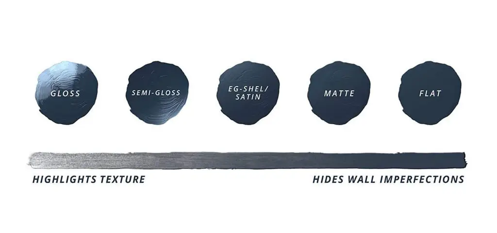
Ideal sheen:
- Eggshell on walls for soft reflection and richness
- Satin on cabinetry or trim for subtle sheen and durability
- Matte for a modern, velvety look in low-traffic areas
Design tip: Use layered lighting, overhead + lamps + accent – to highlight the nuance and depth in this stunning moody hue.
Pin this for Easy Reference:

What Colors go with Benjamin Moore Silhouette?
Silhouette works beautifully with so many hues, from warm whites to earthy neutrals and rich accent shades. Whether you’re selecting a color for an adjoining space or layering tones within the same room, these pairings will help you create a harmonious and inviting palette for the whole home.
- Explore deeper, equally moody shades with soft green gray or earthy undertones like Benjamin Moore October Mist
- Pair Silhouette with warm off white paint colors that feel soft and inviting rather than stark. Try Benjamin Moore White Dove or Simply White
- Consider taupe leaning neutrals with subtle purple or rosy undertones like Benjamin Moore Pale Oak.
- Avoid pairing Silhouette with true cool grays. Instead, choose warm gray tones with a hint of green
- Warm greige paint colors can be stunning with Silhouette, especially those with soft green undertones like Edgecomb Gray
- In the mid tone range, look for warm, stone inspired neutrals like Benjamin Moore Stone Hearth
- Silhouette looks stunning with rich accents like forest green, deep plum, camel leather
Does Benjamin Moore Silhouette work with Honey Oak Trim or Cabinets?

YES! If you’re modernizing a home with existing wood tones, Benjamin Moore’s Silhouette pairs beautifully with Honey Oak (aka: Golden Oak), AND Natural Maple.
Honey oak:
Creates contrast and sophistication, grounding the golden tones rather than competing with them.
Maple:
Adds warmth and richness to lighter maple tones, creating a timeless pairing.
90s Decor updates are easier with my with designer-curated palettes for homes with Honey Oak, Brown Oak, Maple and Cherry wood – HERE!
Our modern Paint Palette Collection features 15 designer-approved paint and color palettes to update your home and beautifully complement Honey Oak, Golden Oak, Brown Oak, Maple or Cherry Wood cabinets, trim or floors.
What Metal Finishes look best with Benjamin Moore Silhouette?
Finishes that harmonize:
- Aged brass or brushed gold hardware
- Natural woven textures
- Creamy linen and boucle
- Warm natural stone and warm veined quartz

Wallpaper Pairings
To highlight the rich espresso depth of Silhouette AF-655, I paired it with two warm, creamy floral wallpapers, a combination that feels both modern and timeless. The delicate botanical patterns balance this moody hue beautifully, adding softness and movement while letting the color’s subtle notes of charcoal take center stage. This pairing creates a sophisticated yet welcoming look, especially when layered with warm wood tones, soft lighting, and brushed brass accents. It’s a perfect example of how choosing the perfect color and complementary textures can elevate a space, bringing in elegance, comfort, and a refined boutique-hotel feel right at home.

Final Designer Thoughts
Benjamin Moore’s Color of the Year for 2026 is a standout. Silhouette AF-655 offers warmth, sophistication, and emotional depth. It gives rooms character, elegance, beauty, and an inviting coziness.
If you love neutral palettes but want something more nuanced, or if you’re seeking a paint color that works with your existing wood tones and timeless décor, this shade is a stunning choice.
Silhouette AF-655 feels personal, intimate, and deeply stylish. The perfect tone for homes that embrace warmth, connection, and curated living.
Designer Color Palettes for Oak, Maple, Cherry & Other Similar Wood Tones
Created to help you modernize your home without painting or replacing existing cabinets, trim, or flooring, these designer-curated color palettes take the guesswork out of choosing wall colors, whites, and accents that work with real wood tones. modernize your space without painting the cabinets or trim.
Explore the Designer Color Palette Collections→


